Milltown Partners Strong presence, bright future


Milltown Partners came to NB with big ambitions. As a prestigious advisory firm with a roster of high profile clients, their identity was the model of discretion. But after a decade of growth and change it was time for the brand to take a bold leap. Our rebrand reflects a confident, energetic organisation at the forefront of their field.
[Branding] [Strategy] [Motion]
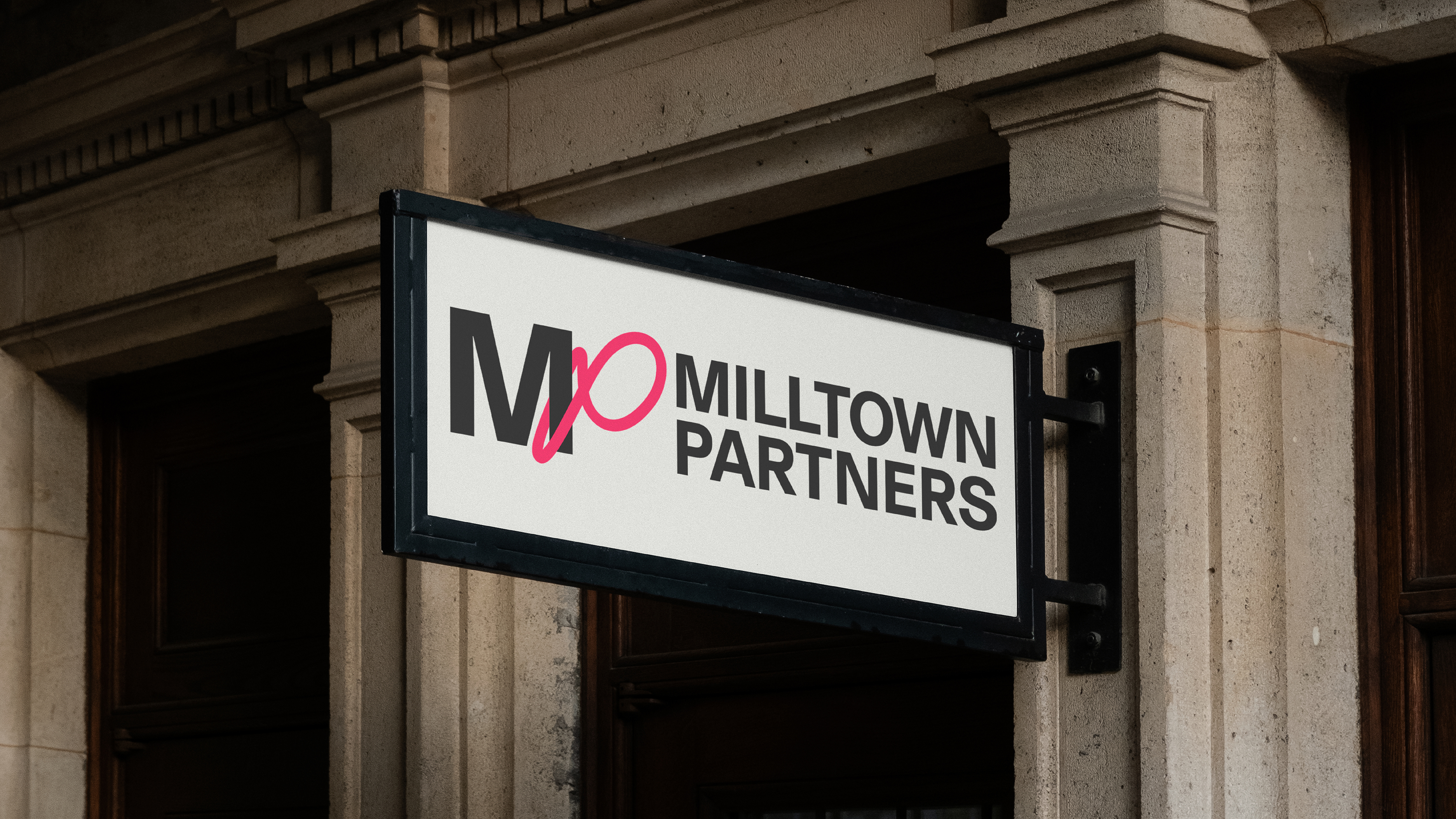
NB’s design reflects the duality of Milltown: tradition meets innovation, analytical rigour paired with creative thinking, all embodied in a sleek, modern monogram. A thread of striking, hot pink – a bold change from the old corporate blue – darts through the whole identity.
As an employee owned company, the new identity was close to everyone’s hearts. NB worked collaboratively with the Milltown team to encapsulate what was special about their organisation. We also hosted a series of workshops to make sure that everyone was ready to use the new identity from the word GO.

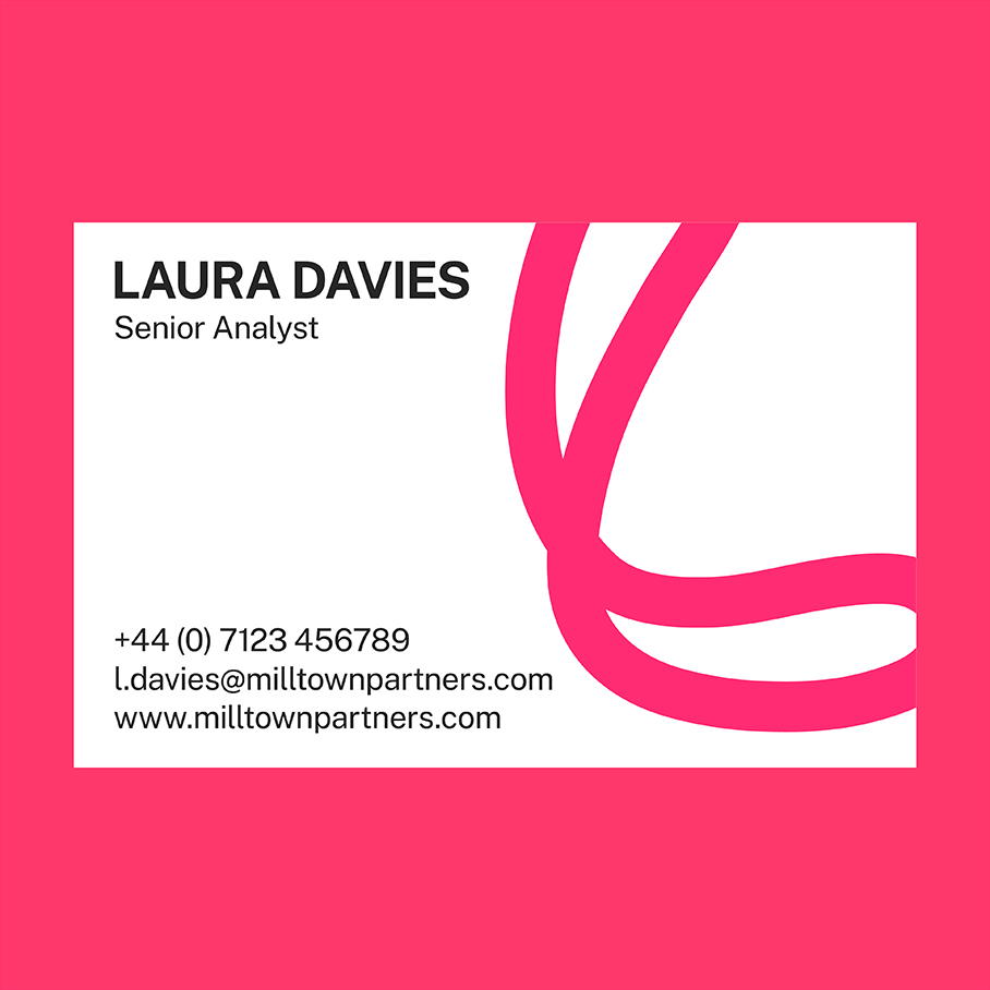
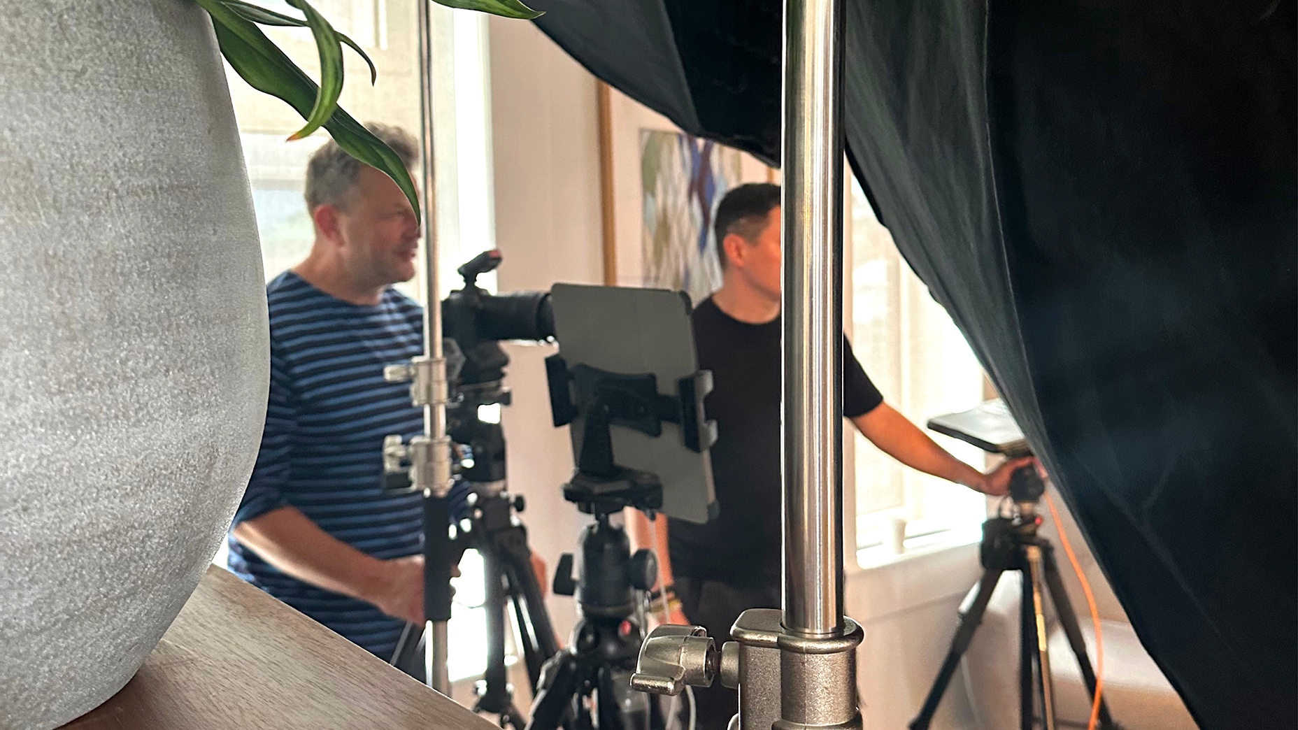
We commissioned portrait photographer Alun Callender to capture the warm yet incisive personality of Milltown.

Brand immersions sessions across 2 continents
Carefully chosen toolkit colours for data visualisation
Pages of presentation templates
Headshots captured over 4 days

“NB’s work gets everyone excited at Milltown about who we are and what we stand for – a step change for the company as it sets out on a new era”
Charlotte Allan Director, Milltown Partners
Does your brand no longer reflect what you do or who you are?
Get in touch
Philharmonie Luxembourg
A rhythmic identity that’s alive with music
[Branding] [Campaign] [Strategy] [Motion]
+44 [0]20 7633 9046
mail@nbstudio.co.uk
NB Studio, 15 Glade Path
London, SE1 8EG
Get Directions