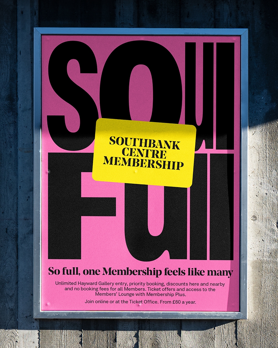
Southbank Centre Membership So full, one Membership feels like many
Inside the Southbank Centre, the brand is everywhere. So much so, it started to feel like nowhere. In a sea of that unmistakable yellow, membership comms were invisible.
We worked together on rebranding their membership identity to increase sign-ups and retention, defying convention by turning the challenge into the concept itself.
[Branding] [Arts & Culture]
As well as issues with their iconic identity, the high number of benefits included in the Southbank Centre membership made it difficult to communicate its value clearly.
People are selective about arts memberships; they will avoid holding too many at once and often cancel one in favour of another. Southbank Centre needed to stand out as the top choice in the mix.
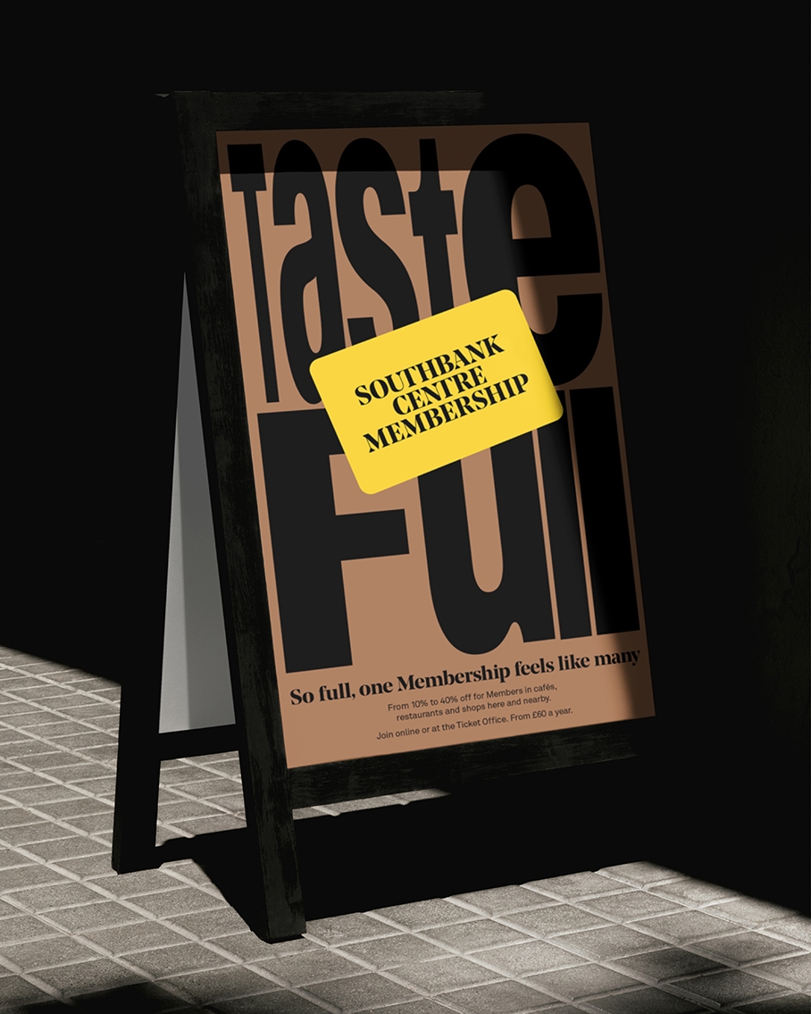
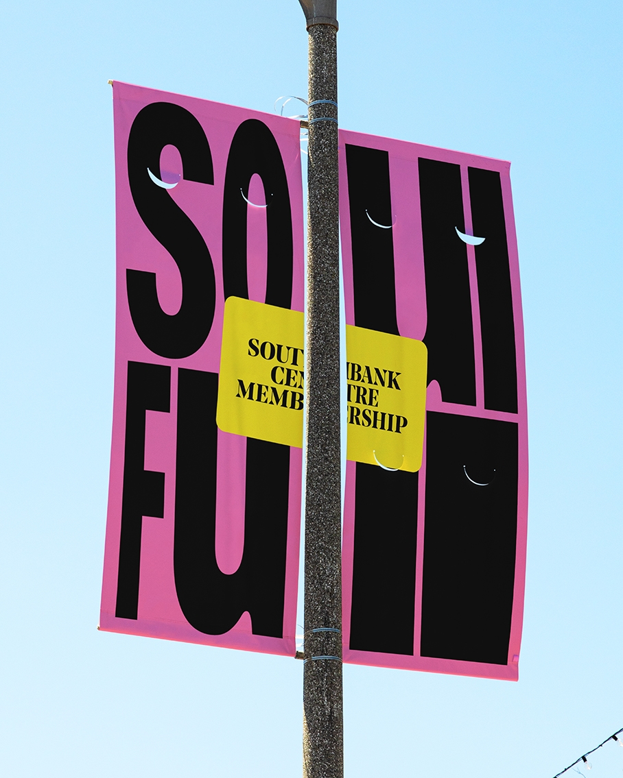
But, the key USP of Southbank Centre is that it’s so full of diverse art forms. It feels like having multiple memberships in one. There’s no need to cancel or interchange, everything is already under one roof. This insight informed our strategy: “So full, one Membership feels like many.”

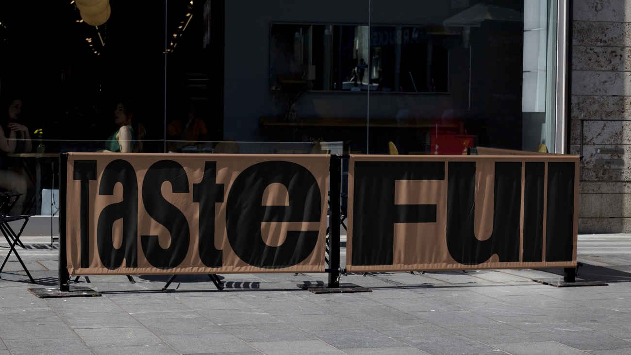
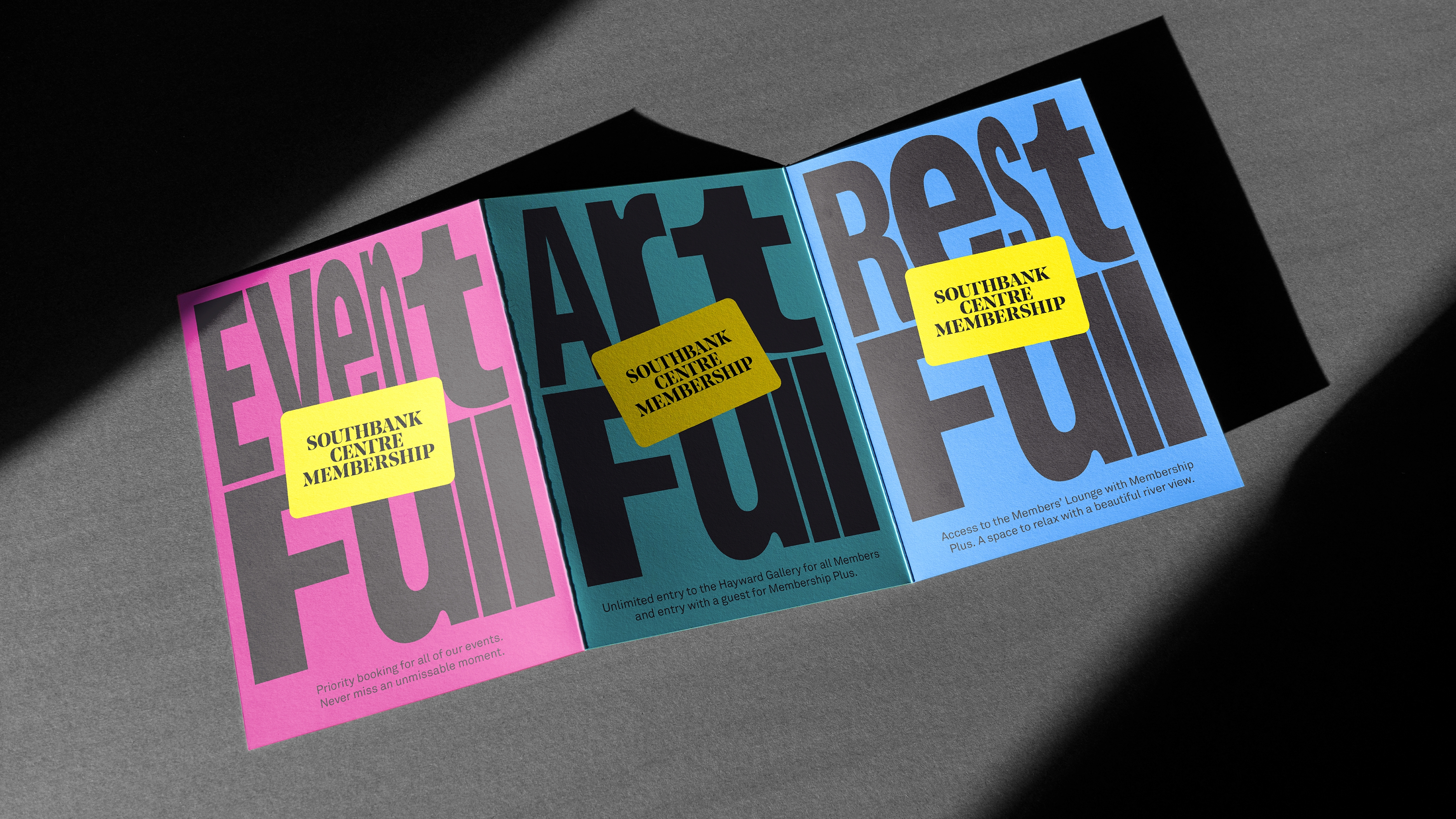
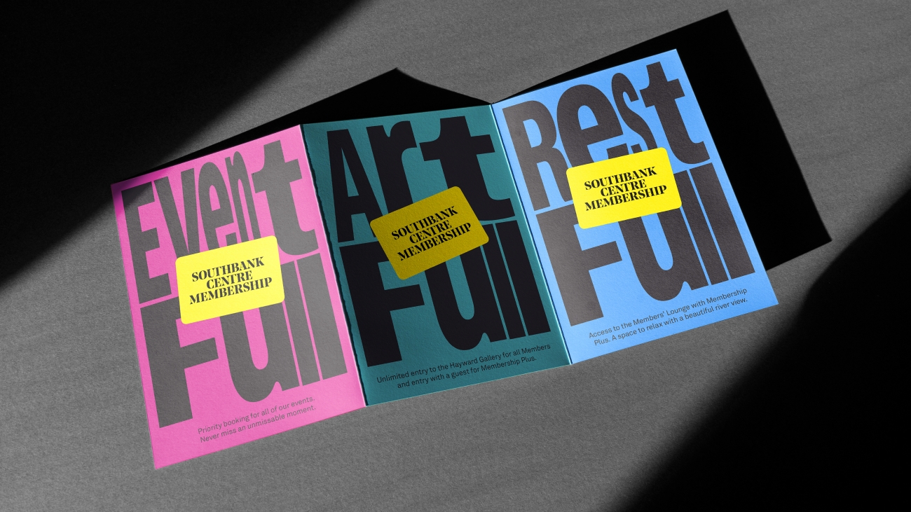
We used the membership journey to shape our messaging strategy, ensuring we delivered the right message at the right moment for maximum clarity and impact. Thoughtful, dual-meaning ‘full’ words act as emotive hooks, expanding benefits beyond discounts.
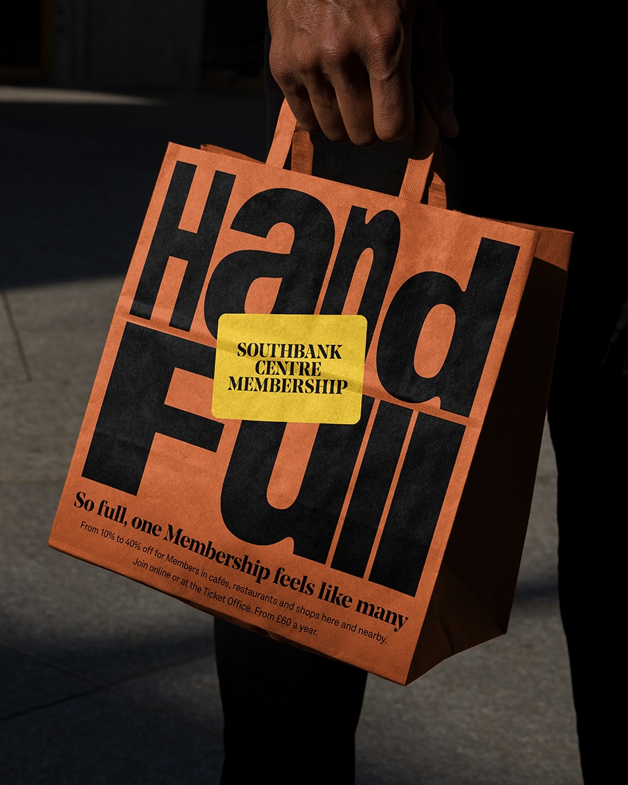
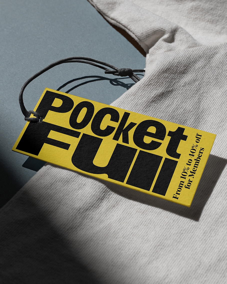
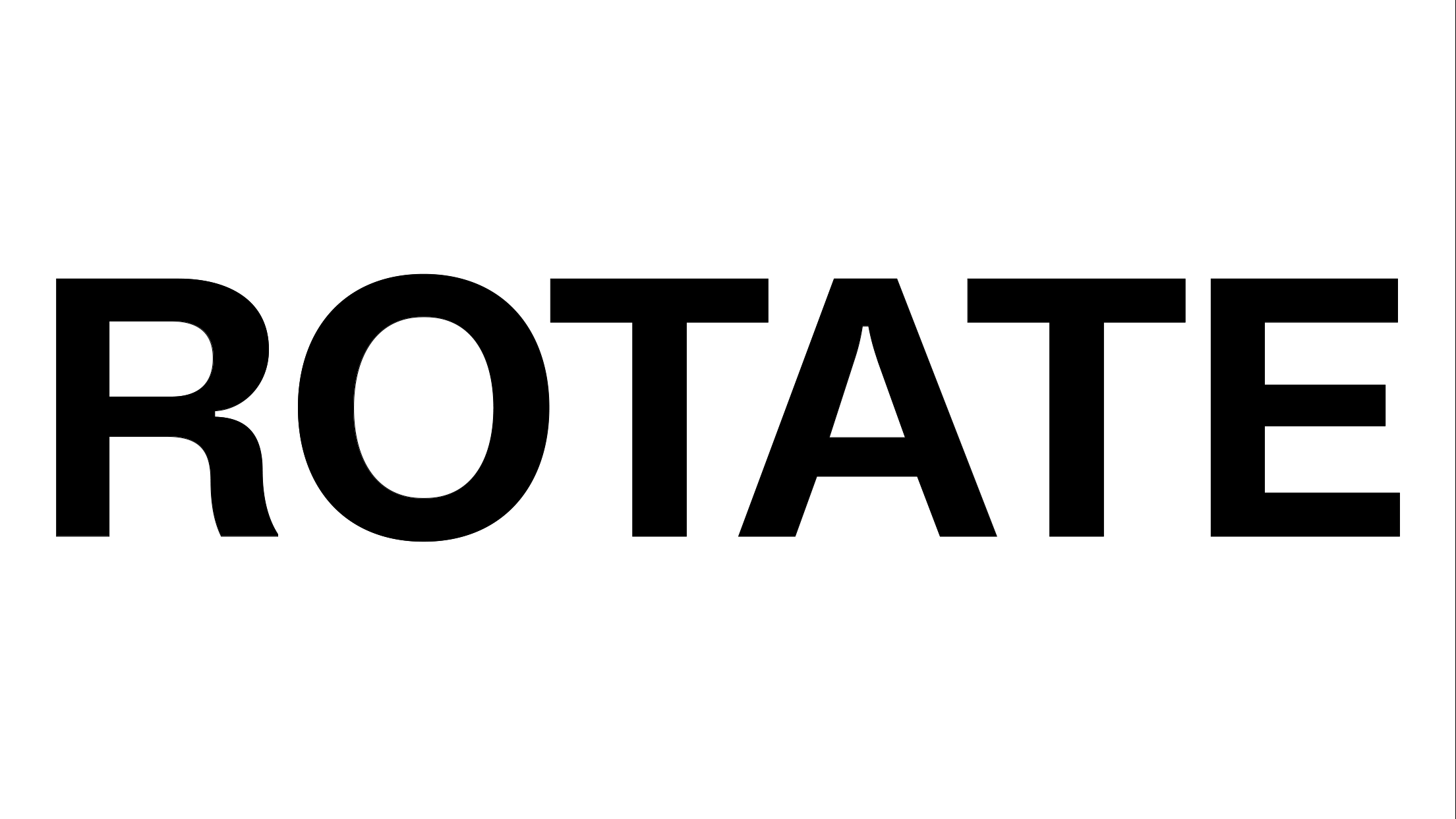
Bold typography dominates each design, visually expressing the fullness of the offer. In contrast, a multi-colour palette cuts through the iconic yellow. In digital, the letters are in motion, unable to settle because of how full the membership offer is.
Want to be impossible to ignore?
Get in touch
+44 [0]20 7633 9046
mail@nbstudio.co.uk
NB Studio, 15 Glade Path
London, SE1 8EG
Get Directions