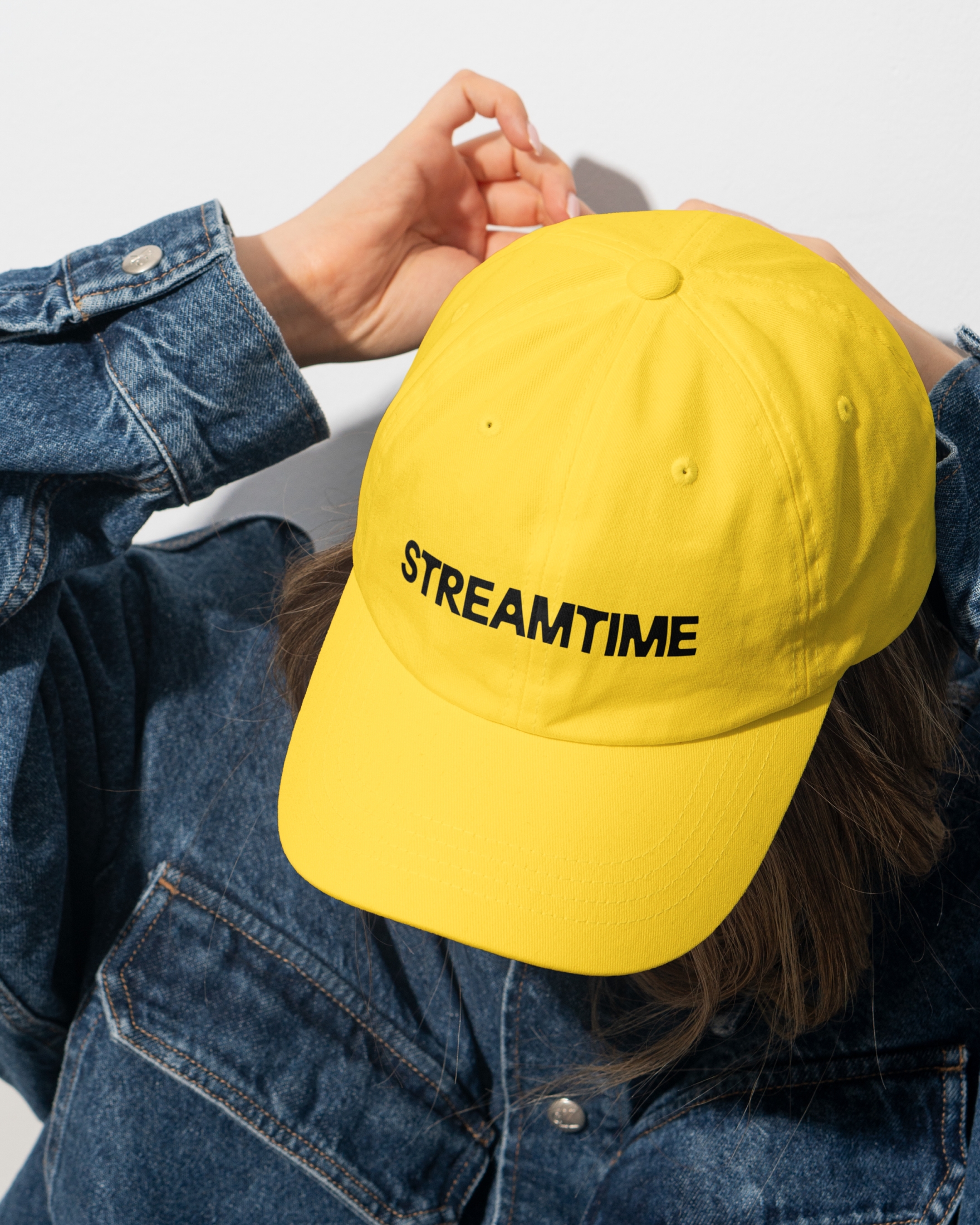
Streamtime Business balance for creative chaos
Streamtime isn’t your standard project management software. They’ve been rethinking timesheets since 2002. Made by creatives, they’ve turned timesheets into intuitive to-do lists and built holistic features that actually fit how creative businesses work. However, their new internal strategy, Productive Wellbeing, feeling good while doing great work, called for a change.
They are still staying true to what they know but moving confidently into the ‘Wellbeing at work’ space. That’s where NB came in. We rebranded Streamtime to reflect this radical shift. We defied convention by making the tension between productivity and wellbeing the big idea and embracing imperfection unlike more ‘polished’ competitors.
[Branding]
No other competitor approached productivity and wellbeing quite like Streamtime, placing it not as a nice-to-have but at the very core of the product. Productive Wellbeing was never about perfection. It’s about the real, messy tension between head and heart. The daily balancing act of creative work and the commercial realities of running a business.

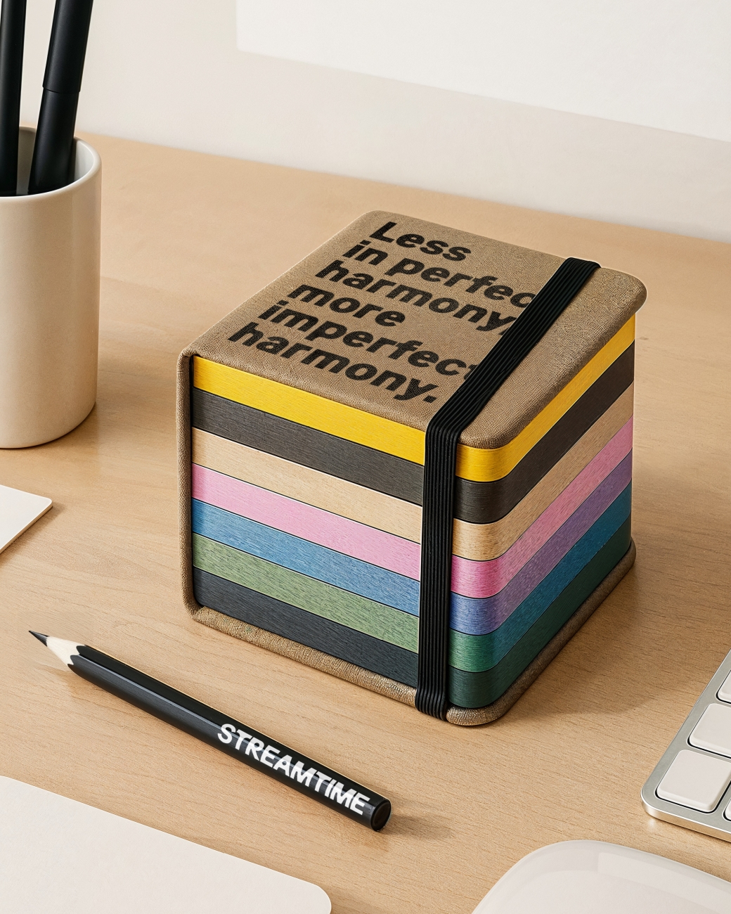
Inspired by empathy for the creative community, our guiding idea, Business Balance for Creative Chaos, ignited a digital transformation across multiple touchpoints. This contrast is reflected in the tone of voice, which sometimes uses paradoxical language to establish a distinctive style. While maintaining Streamtime’s original humour.

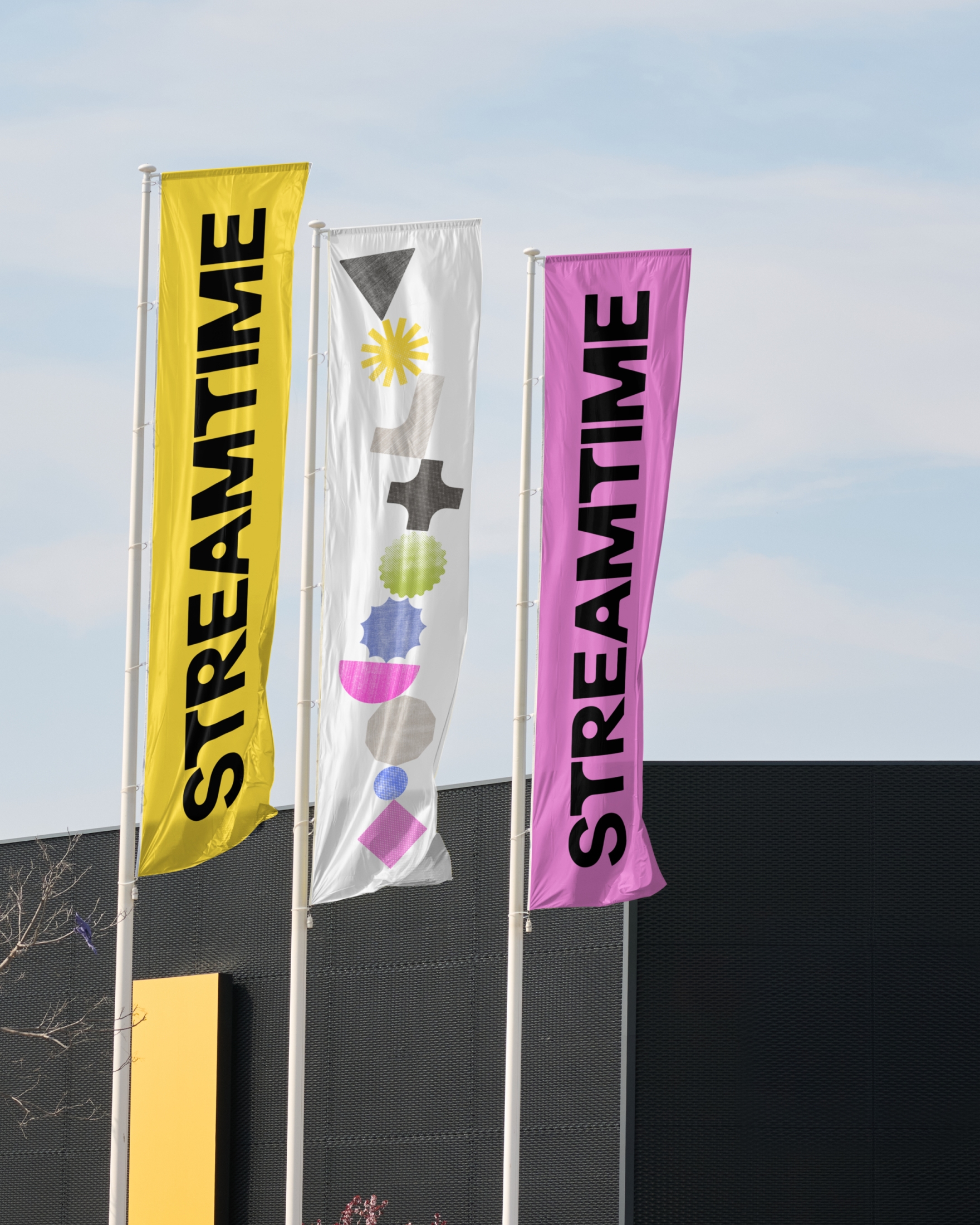

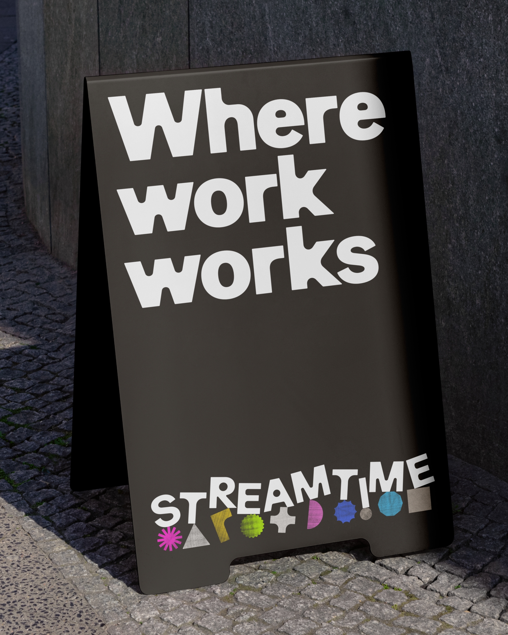
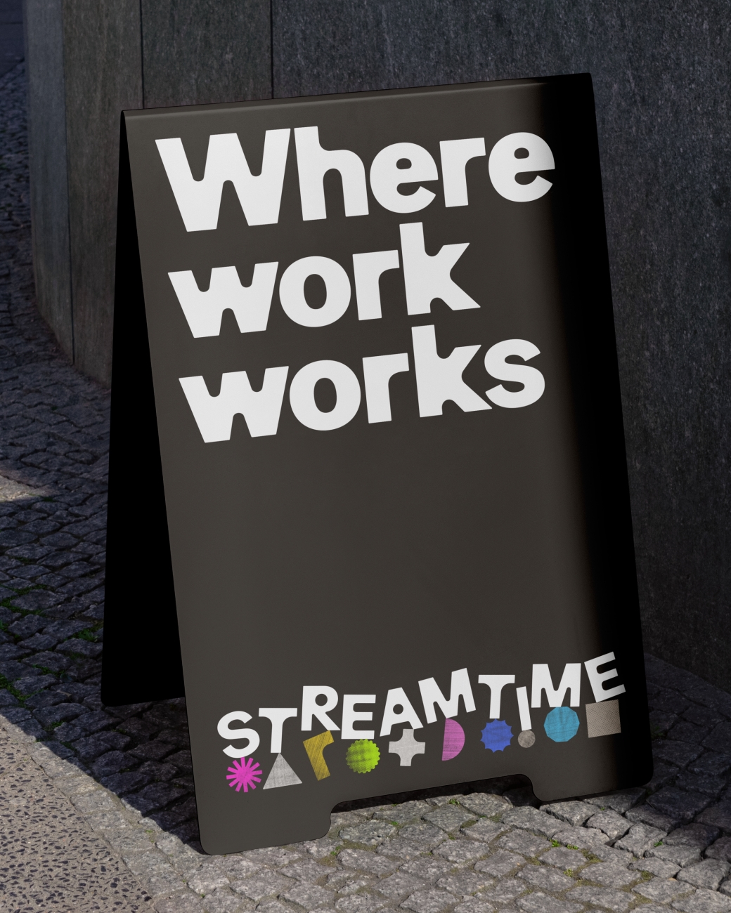
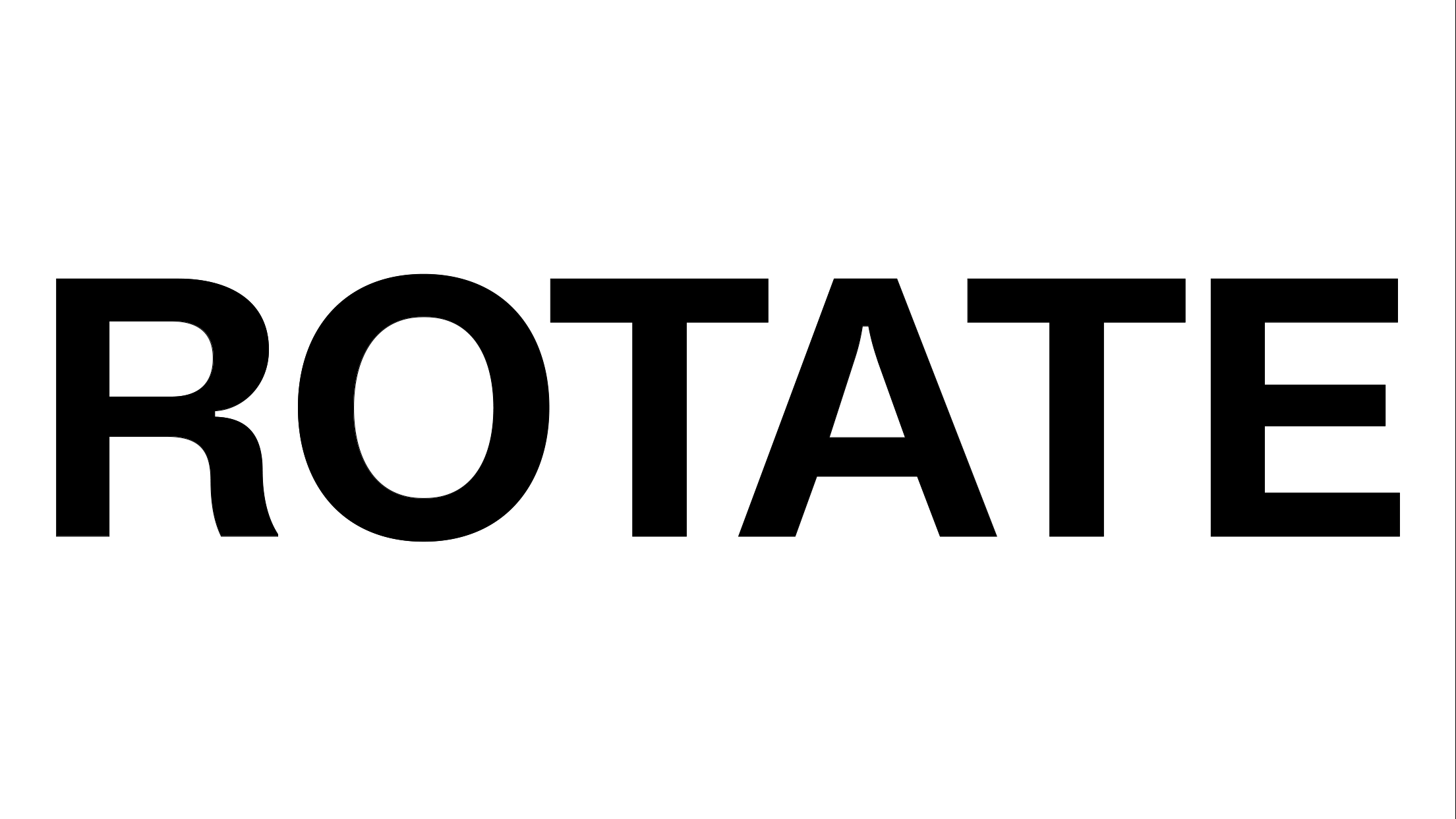
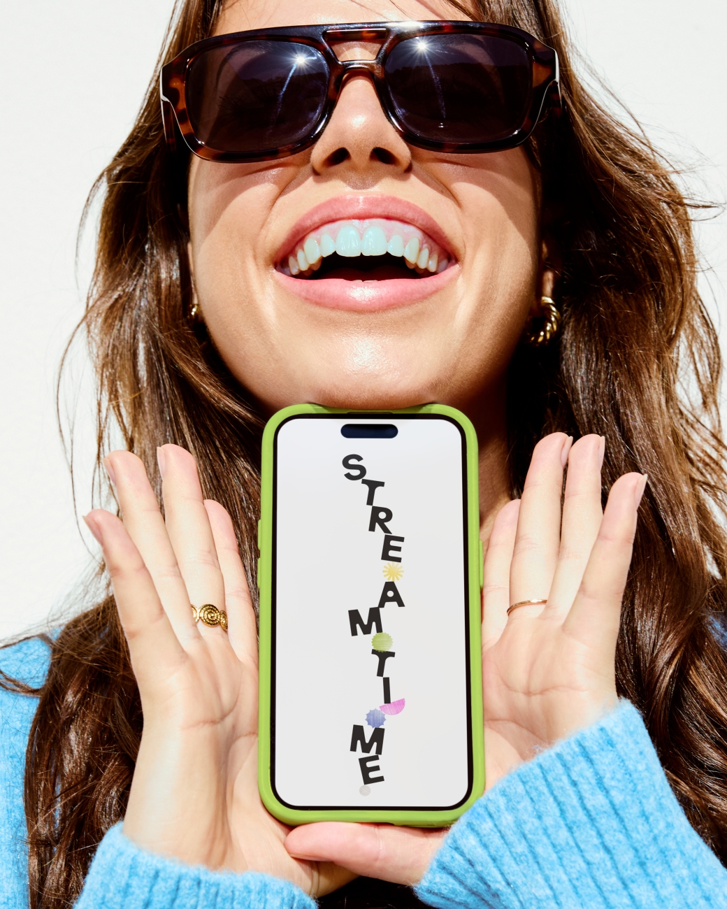
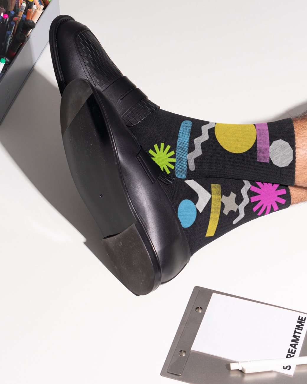
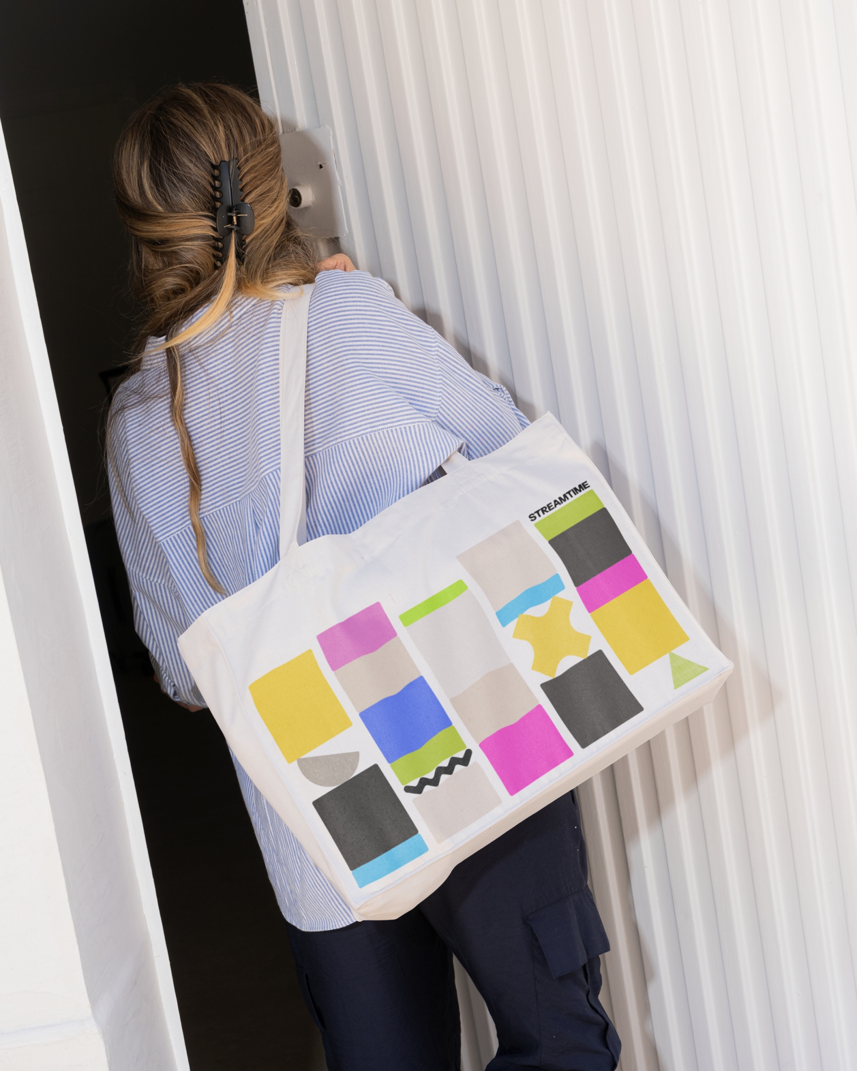
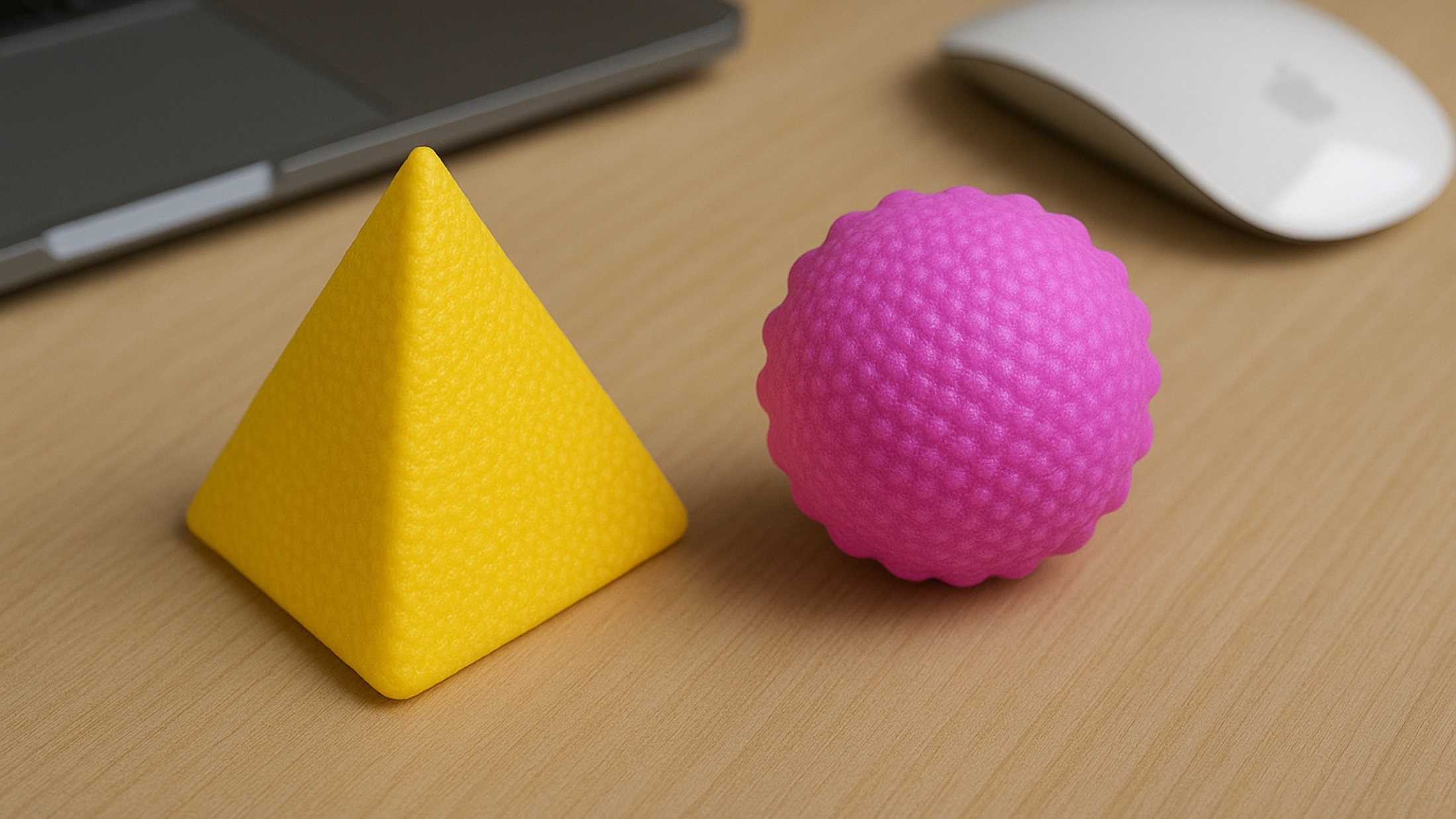
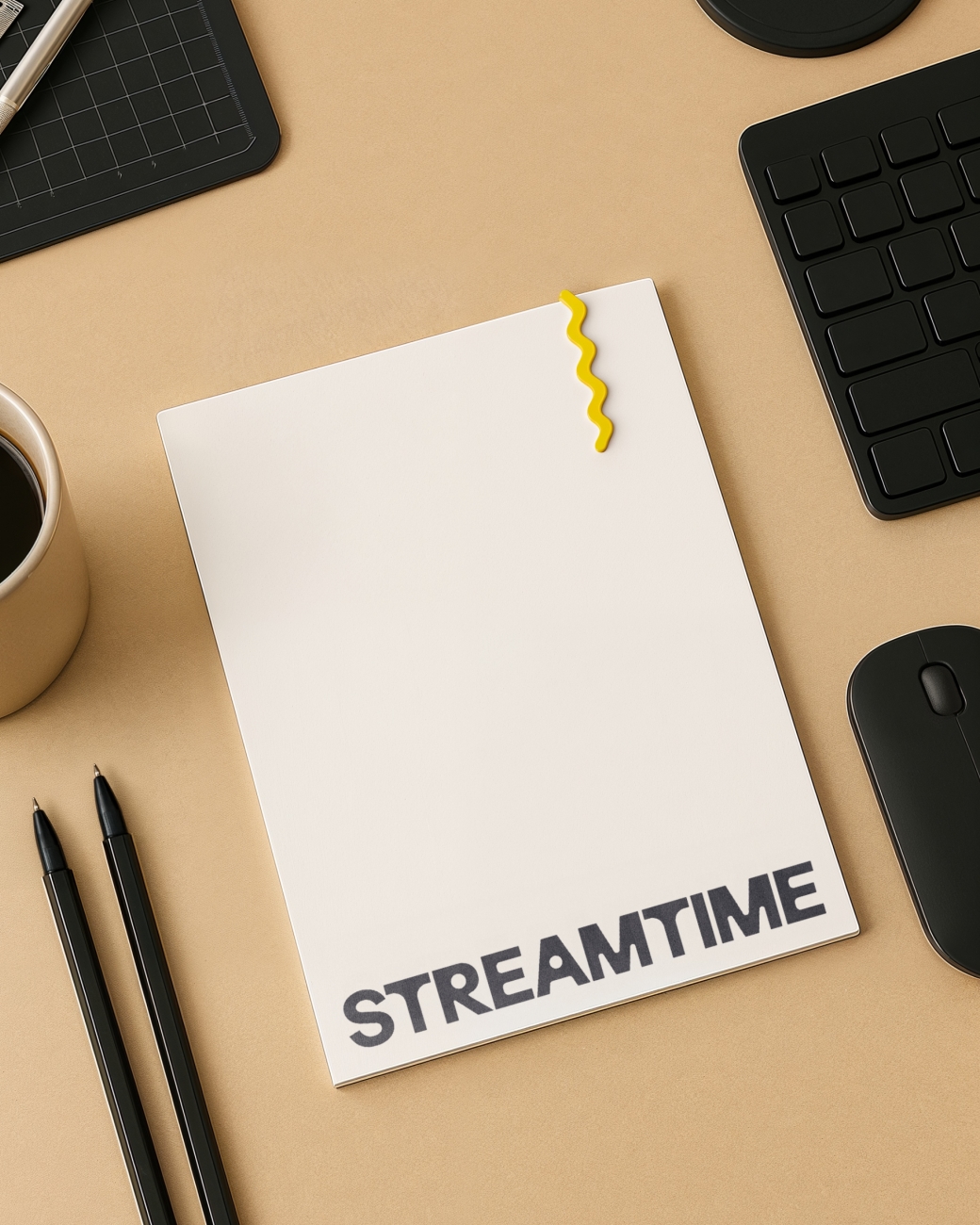
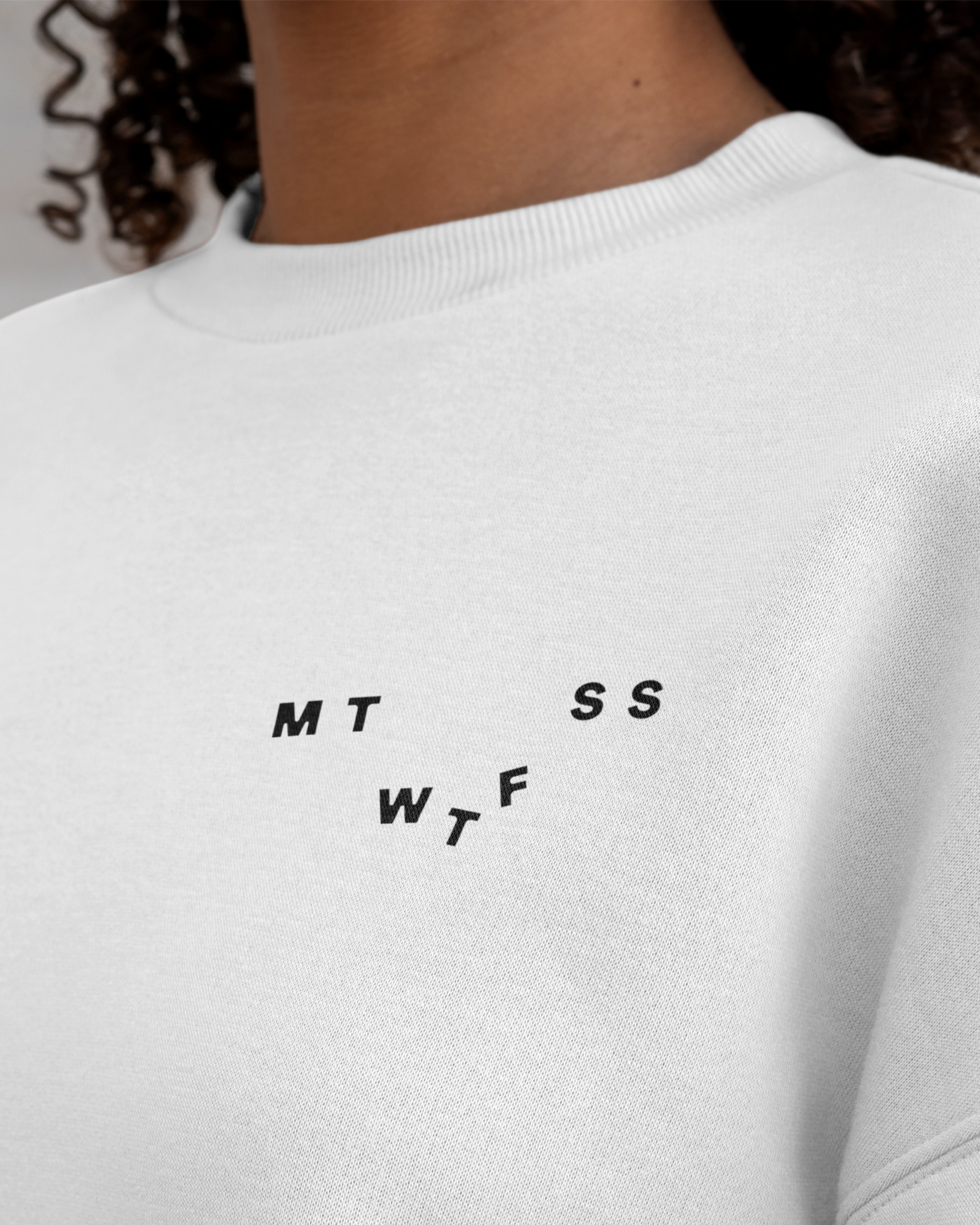
The identity system is grounded in a dynamic set of abstract shapes based on the product’s current interface, but now more joyful, tactile, and slightly off-kilter. Influenced by the Kiki/Bouba effect, the forms mirror the emotional peaks and troughs of the creative process. There are seven core shapes, nodding to the days of the week.
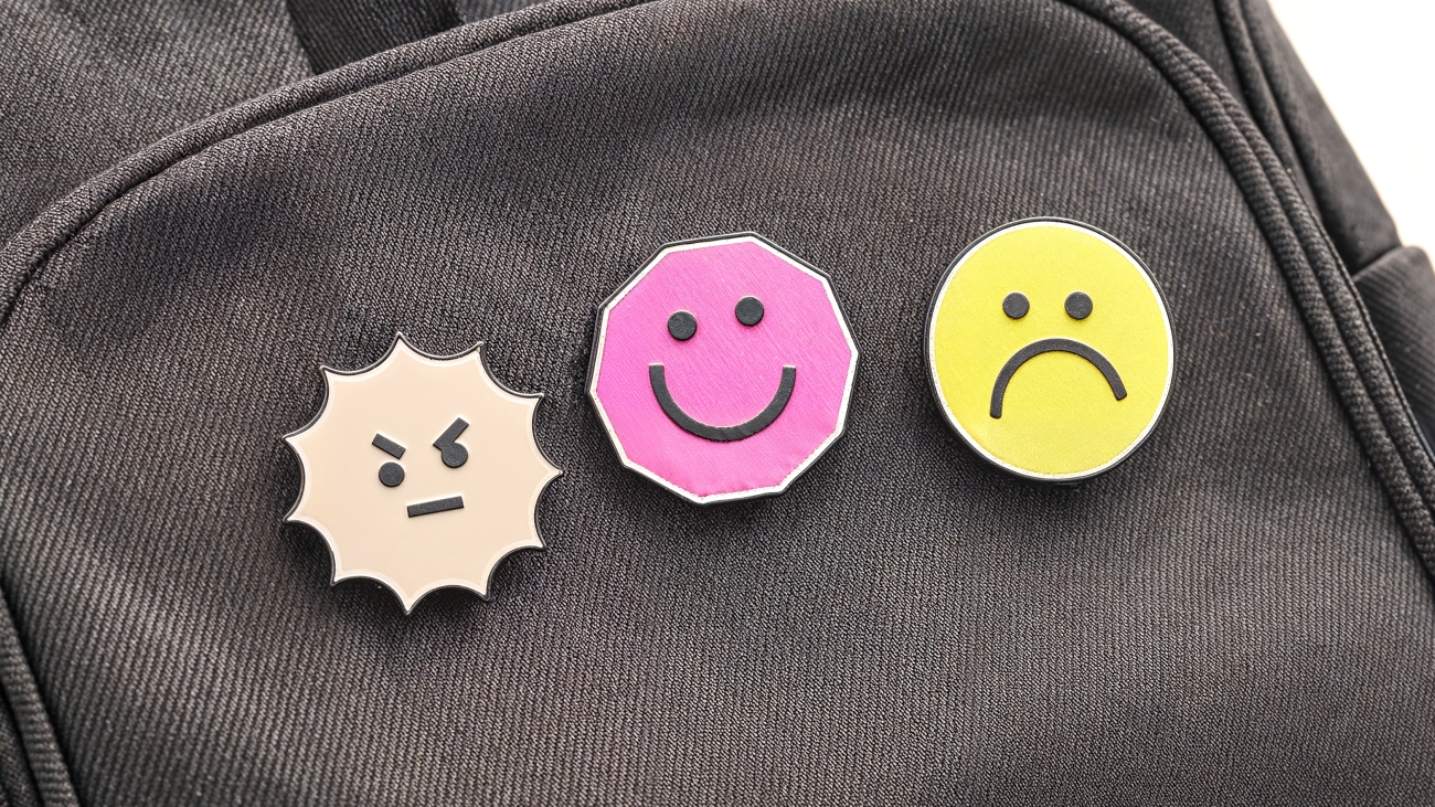
Our core shapes transform into expressive icons that capture a wide range of human emotion. These shape-based emojis reflect our different moods throughout the day with a sense of humour.


Microinteractions are subtle yet full of personality, breathing life into the brand identity and reinforcing our core idea throughout the website design. In collaboration with Webflow designer Koysor Abdul, hover buttons, emo-shapes, and cards respond with playful tilts and wobbles, signalling interactivity. These movements are layered with stacking and falling effects, adding depth and energy to the experience.


Layouts intentionally break grid rules by stacking paragraphs as if they could topple over. We reject Newton’s laws of motion and replace them with our own rules of imperfect balance. Never still and always doing the opposite.
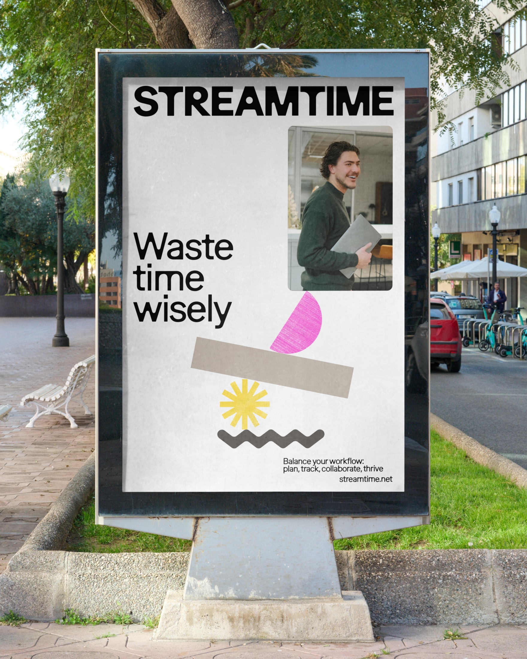


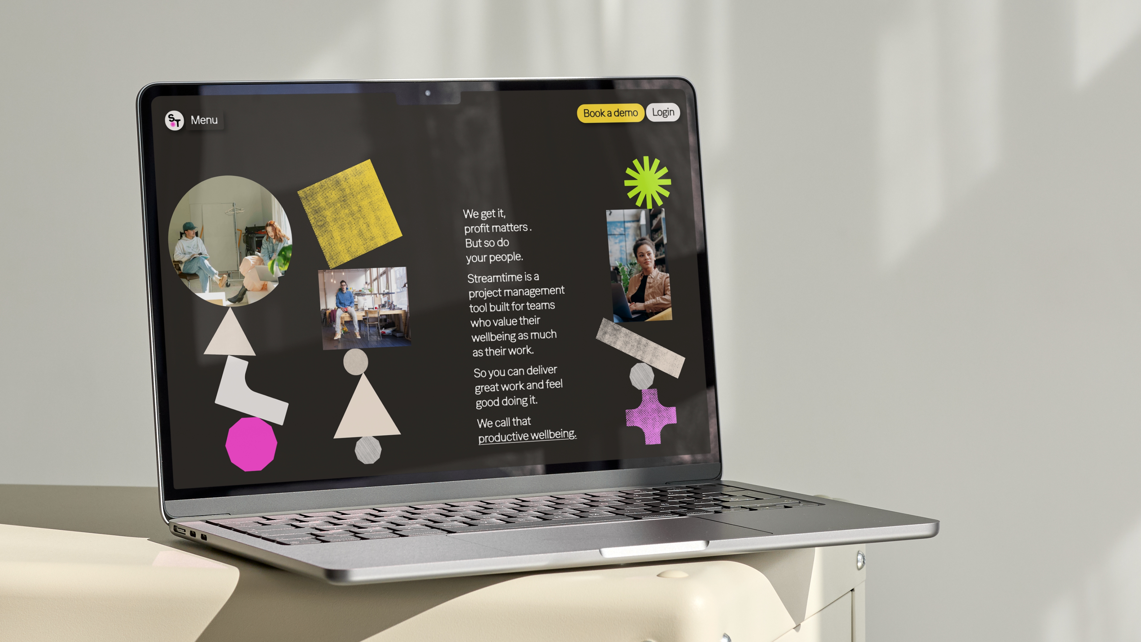
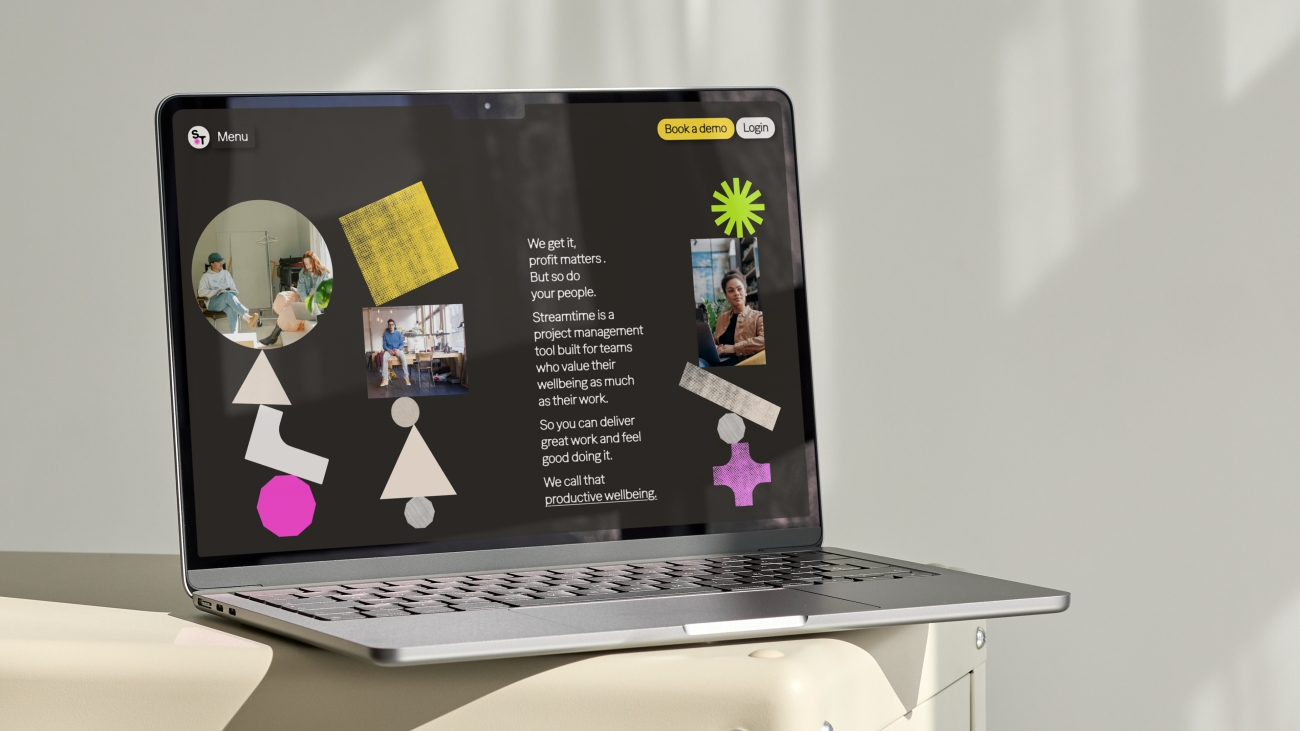
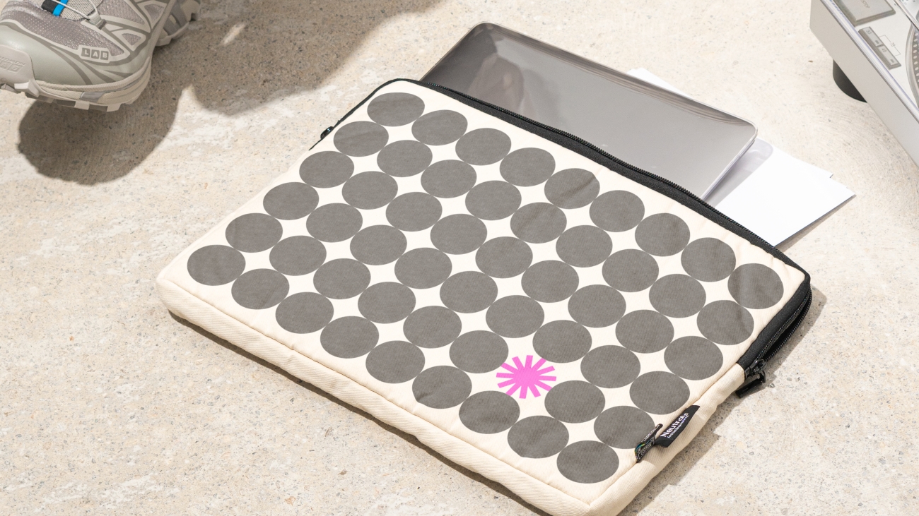
Our collage style reimagines familiar stock photography with a gritty, photocopied texture. Stripped of polish and perfection, these images reflect the raw, imperfect nature of creative work.We embrace everyday office tropes, file drawers, notebooks, trophies and give them new meaning through bold, colourful shape overlays.
Despite working across opposite hemispheres, we both wanted to rethink the typical agency and client dynamic. “Nothing to hide, everything to share” became our mantra for the project. Sharing rough ideas early, capturing raw internal discussions in our regular meeting recordings, and prioritising openness over TA-DA perfection. That approach gave both sides space to challenge, experiment, and arrive at something more genuine.
“When NB Studio pitched this concept, we were all in… You’ll see this idea in the shapes, the falling, the tilting and teetering and not-so-perfect movements… even in the quirky hover state for the buttons (my personal favourite little detail in this website execution)!”
Sarah Nguyen Head of Brand and Product, Streamtime
Need to align your business and brand?
Get in touch
+44 [0]20 7633 9046
mail@nbstudio.co.uk
NB Studio, 15 Glade Path
London, SE1 8EG
Get Directions