Put away the Pantone
Designers looking for the most impactful colour choice won’t find it in CMYK. In fact, the answer’s right here in Black & White.


Question: What colour do you get if you mix all the colours of the visible spectrum? Answer: White
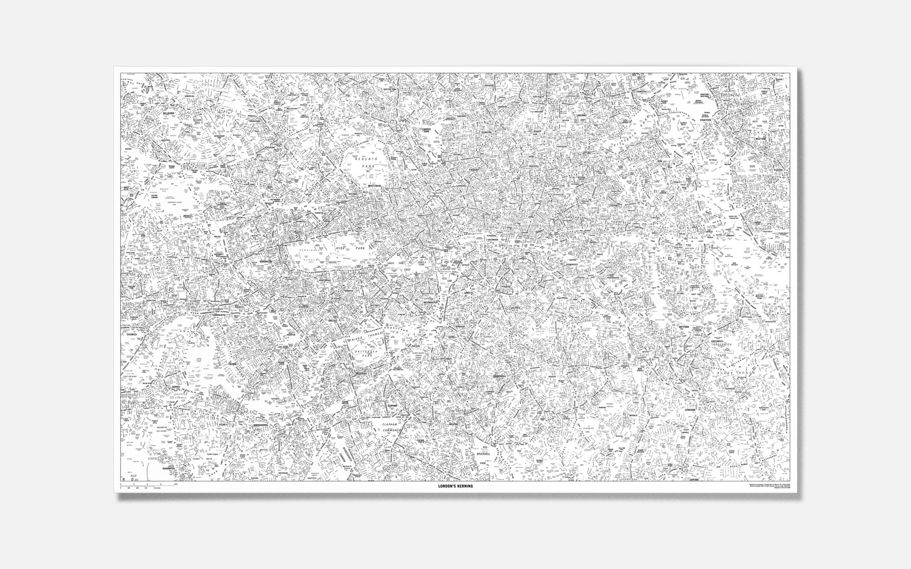

London's kerning
Impossible! But I was amazed when during a colour lesson way back on my foundation course the teacher showed us a spinning colour wheel and it went white! The Colour black on the other hand is the result of the absence or complete absorption of light – it’s a colour without hue.

Let there be light! for the Typographic Circle
The colours black and white in many cultures can represent many symbolic emotions, feelings of purity, innocence, happiness, joy, darkness, sadness…

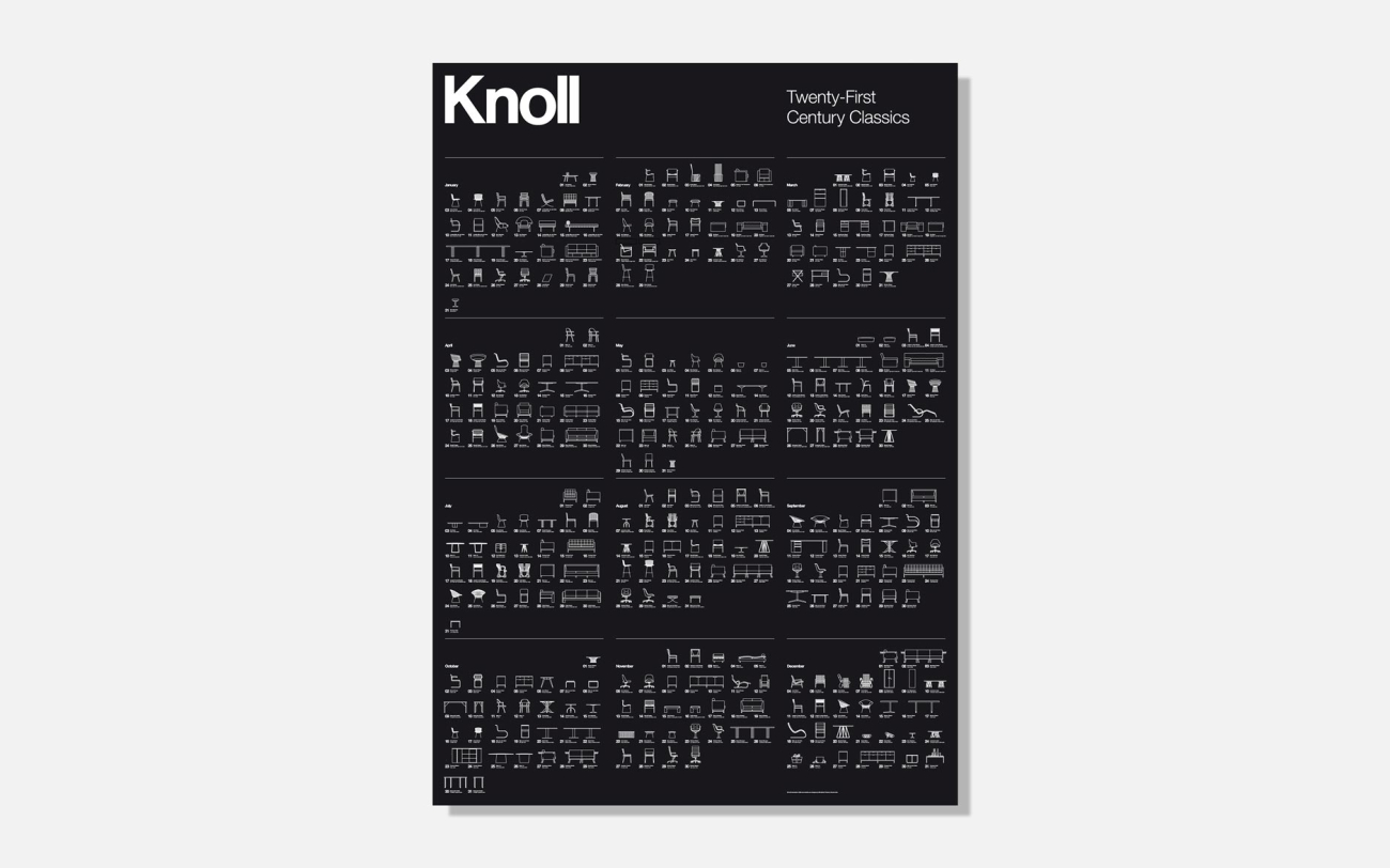
Twenty-First Century Classics for Knoll
However, for us as designers it’s the strongest and most impactful colour choice. It’s also the most neutral and that’s why we tell our designers to design in black and white first – it stops them from getting hung up on colours and makes them see the purity of what they are designing.

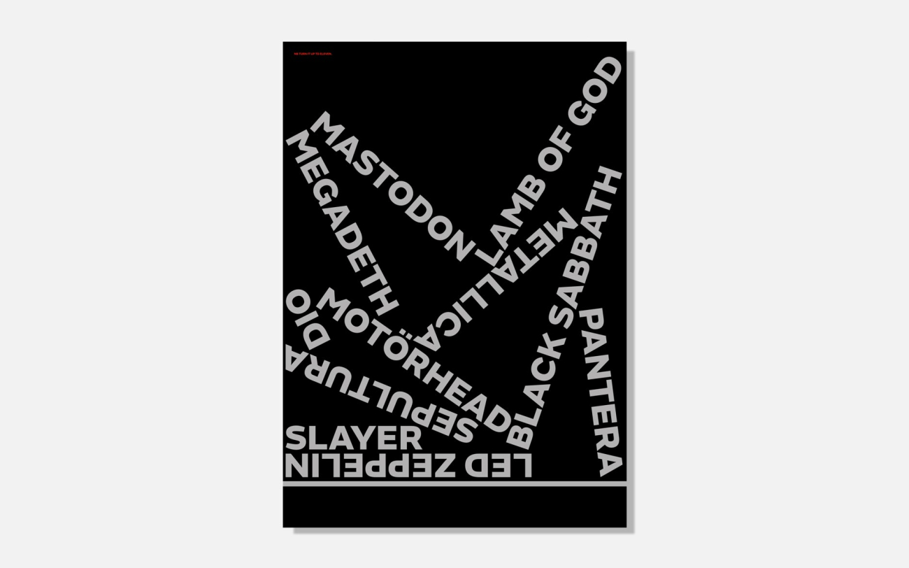
Heavy Metal for Fontsmith

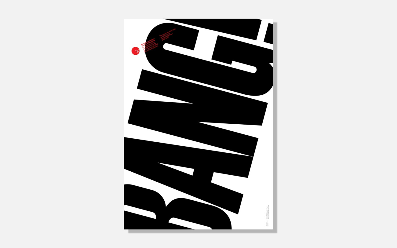
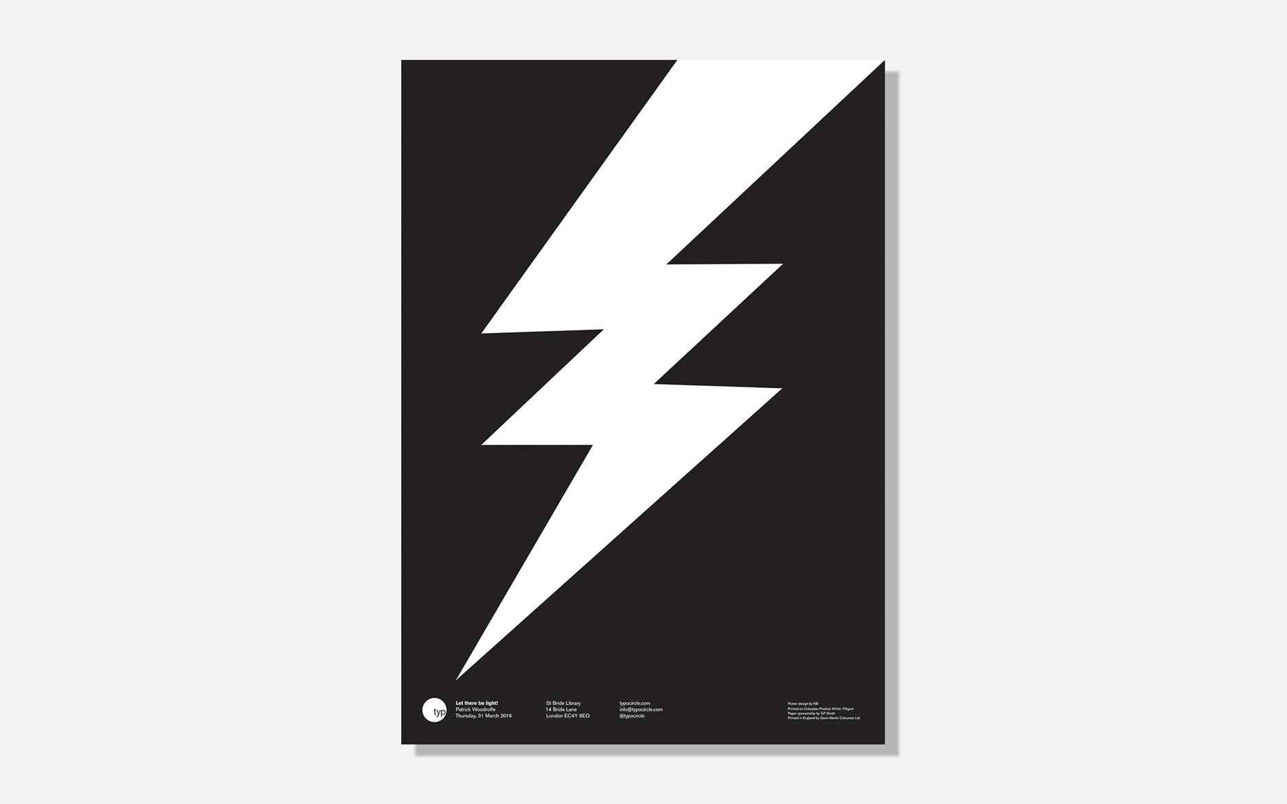
BANG! for the Typographic Circle
The colours black and white will never go out of fashion – think the beautiful and timeless stripes of Joseph fashion packaging or just imagine a chess set not in black and white. It also makes the best and boldest posters (and cheapest).

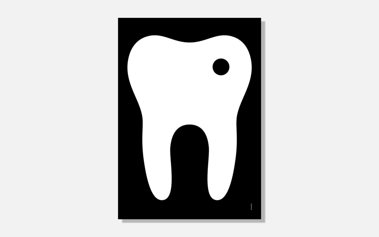
A rotten tooth for the Nifty50 charity auction
Communicate for Blanka
It’s only black and white but I like it.


Fertilisation! for the Spanish Laus design exhibition
Share