What if age got a makeover?
There's a British road sign that features a silhouette of a stooping elderly couple with a walking stick. It's a patronising image. So, we challenged the design community to help us change the image of ageing.


© Y. Ballester, Flickr
The story began when NB and Michael Wolff started working for a new online brand, Spring Chicken, specialising in better design for older adults. We wanted to help them raise brand awareness. At the same time, we saw the chance to use the power of our network to galvanise our designer friends around an important issue. The response was overwhelming – over 200 designs submitted from artists, illustrators and designers ranging from Milton Glaser to Oliviero Toscani.
First it caused a stir in the press – every major title picked it up. Then it caught the attention of government when we lobbied for change at the Department of Transport. After all, weʼre talking here about the generation who came of age in the 1960s and invented youth culture. Admittedly, it might take them a little longer to cross the road these days – probably all that LSD – but that’s no reason to insult them with patronising road signs.


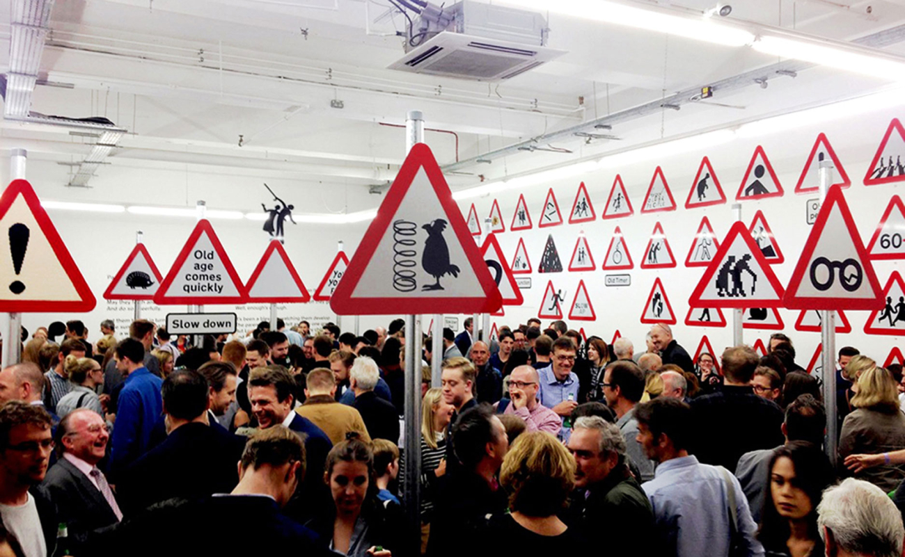
Such was the response that we were inspired to turn it into an exhibition, called Sign Of The Times. We produced 100 signs to the exact size and specification of British road signs, hired a London venue and, over four days, welcomed visitors.


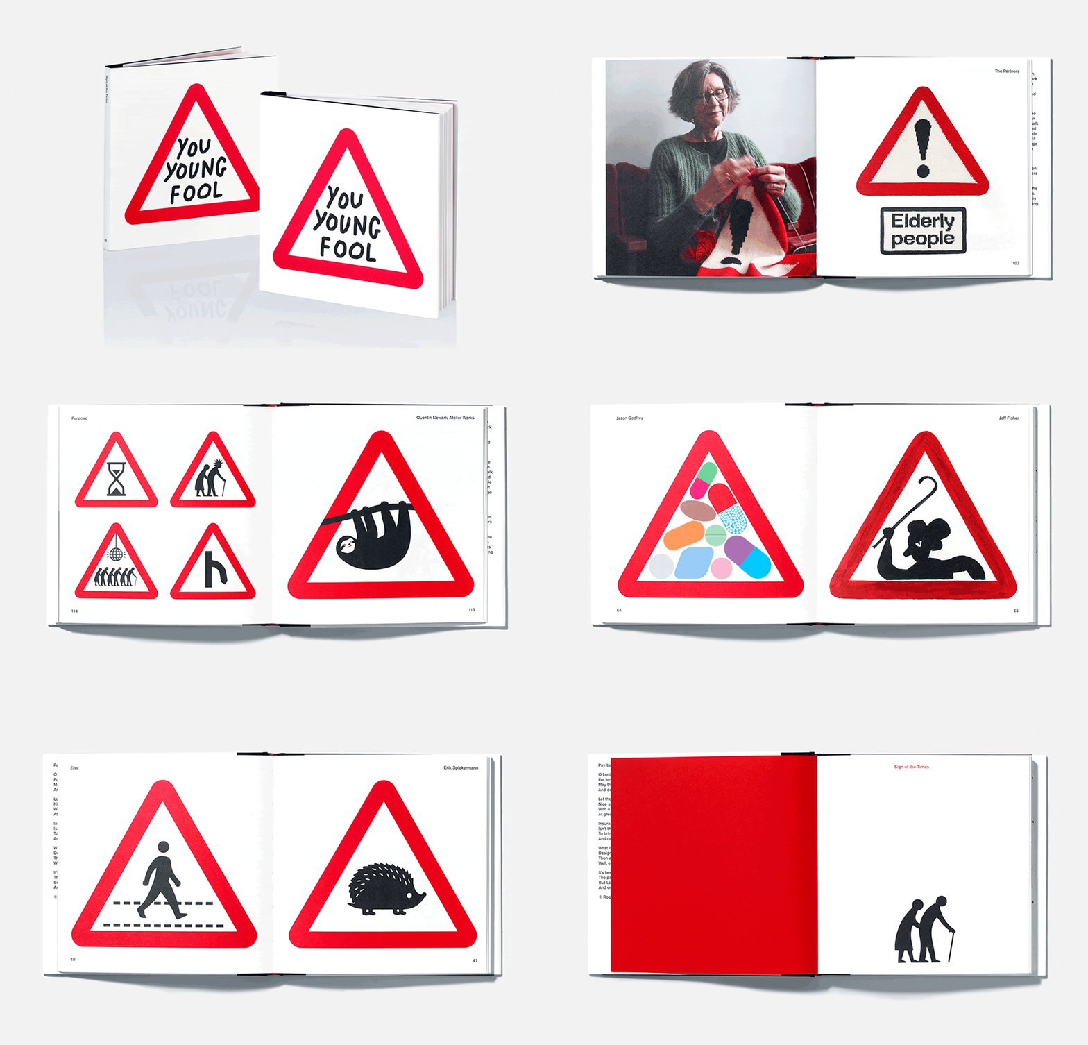
We produced the book of the show, then set up an eBay shop to auction off the signs, raising thousands for Age UK. More recently, the new Design Museum asked us to supply some of the reimagined signs for their New/Old exhibition curated by Jeremy Myerson.
What had started out as a provocation had become a raucous conversation. Sometimes it’s legislation that changes things. Sometimes you just need to see things another way.


