The Joy of Collaboration
At the beginning of 2022 when we rebranded off-broadway theatre Vineyard Theatre we had high hopes of collaborating with the design community across the pond.
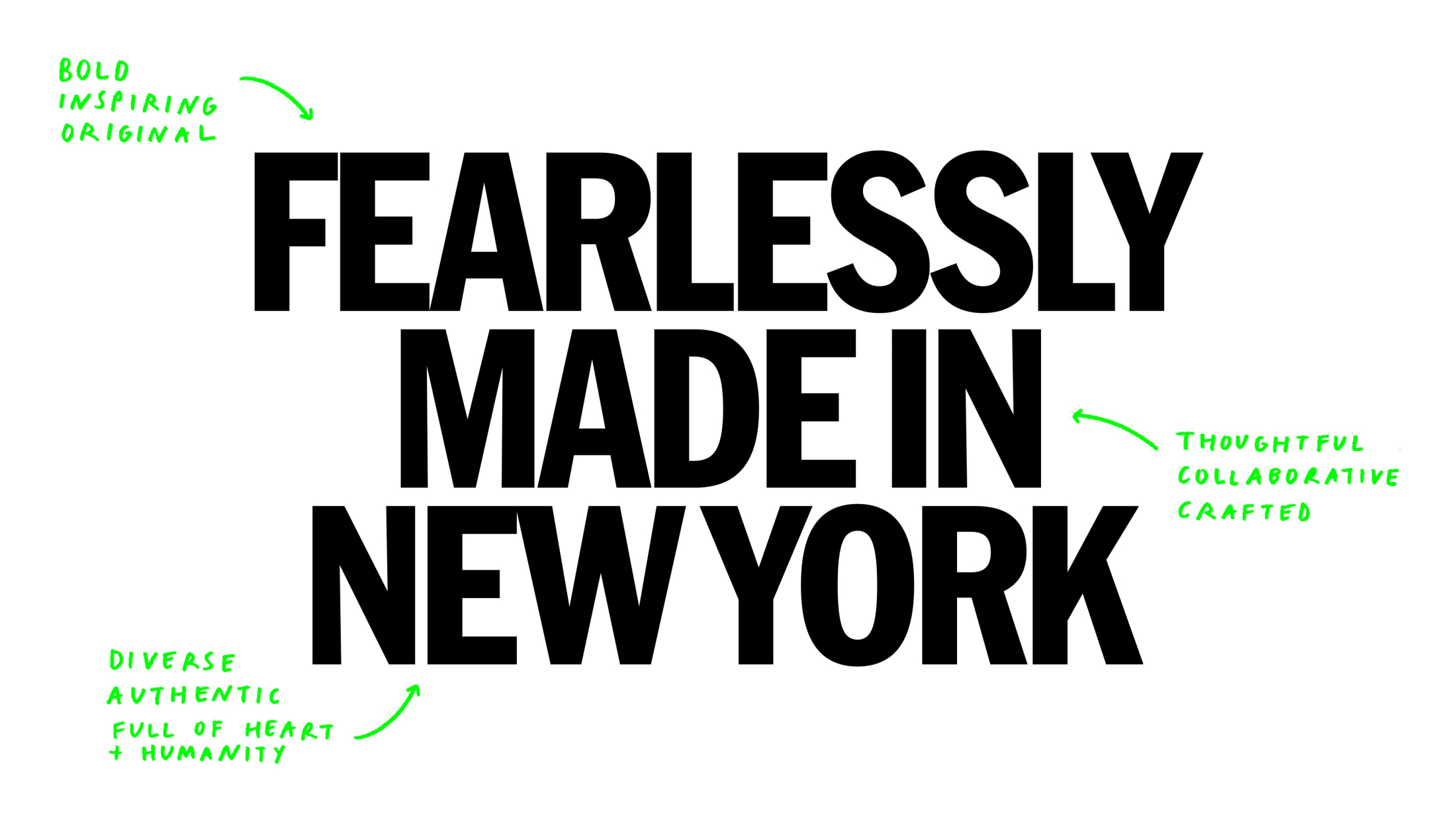

Our strategic territory of ‘Fearlessly Made in New York’ lent itself to handing over part of the brand to New Yorkers – tying in perfectly with Vineyard’s ethos of heroing the makers and making of their performances and shining a light on their own creative community in New York. So why not hand over the logo? Great idea in principle, but in reality?
A question we were bouncing around the studio is “Why would someone in New York create a logo for us (in London) for free, for a brand they haven’t seen yet? Would you?” Our solution was to take a somewhat staggered approach to the brand and invest time and love into it and continue to challenge the conventions of branding. We started the brand using off-the-shelf typefaces designed by New Yorkers, which technically adhered to our strategic territory, but somewhat lacked the bigger idea of collaboration.
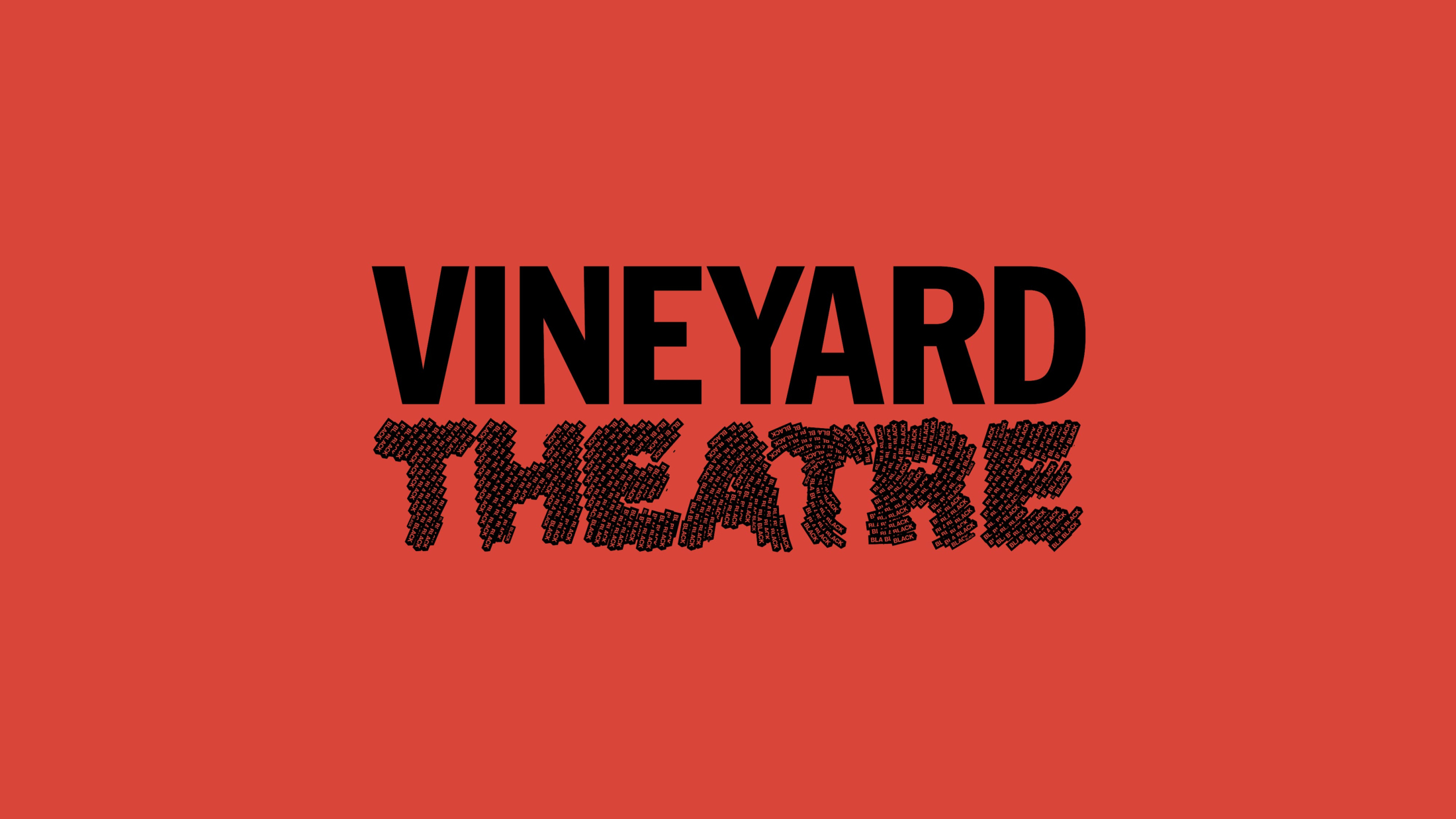
Once the brand launched and gained some traction in the design press, we felt it now had the gravitas to really ramp up the collaborative element – so when working on their second season of key arts we began to really push the idea of collaborating with the New York design community. Our first collaborator was Eddie Opara of Pentagram New York, who created the ‘Theatre’ for This Land was Made, set in Oakland in the late 1960s – around the time the Black Power movement was founded. Eddie depicted the idea of community building and political mobilisation in his logo, with the word “black” amassing to create the individual letterforms.

by Eddie Opara
Eddie said “This simple and compelling design system that NB have created has allowed designers like myself to be bespoke, expressive, cogitative and evocative, aligning to the ideals of the theatre” which hit the nail on the head of what we set out to achieve with the brand.
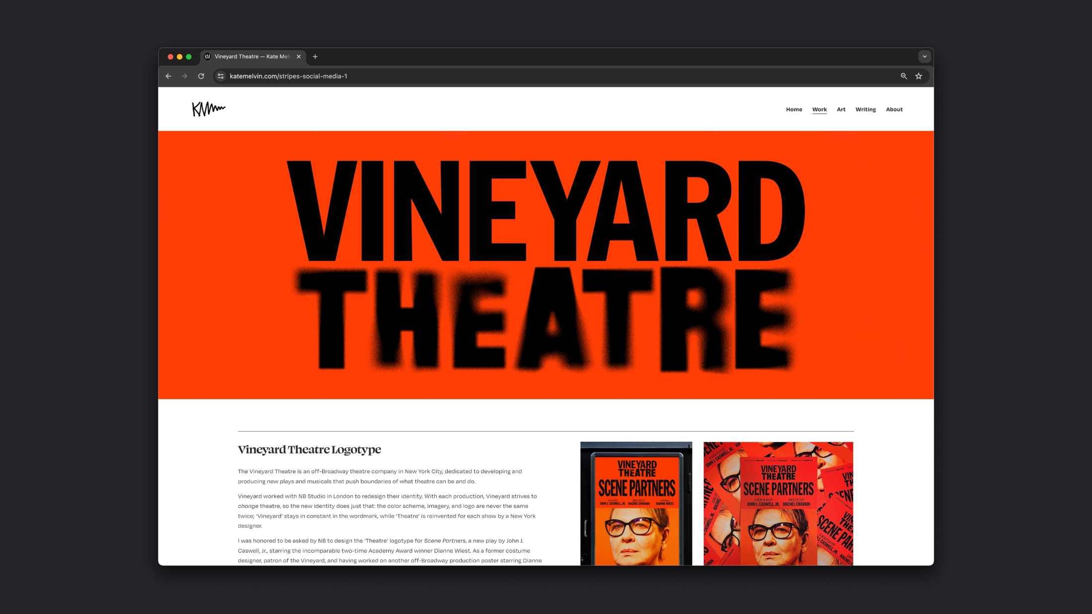
Our second collaborator was Kate Melvin, who when the initial brand was released had left a comment on a design blog suggesting that “if Vineyard ever wanted a New York designer, then to hit her up” so I did just that. For me this was one of the best moments of the whole journey of creating Vineyard’s brand; she had clearly taken the time to fully understand what we were doing and left a comment [that we were unlikely to see] volunteering her time to collaborate with us. She was quite taken aback when we got in contact to take her up on her offer.

by Kate Melvin
For our most recent key art for Russian Troll Farm, set in the Internet Research Agency in the run-up to the 2016 US Presidential elections – we had three designers throw their hats across the pond and into the ring. We ultimately ended up working with Matt Willey (Pentagram New York) on the logo for this performance, but it was really appreciated seeing Graham Taylor and Paul Owen really get to grips with the brief and both adding their own individual spin on the logo.
by Graham Taylor
Graham picked up on the idea of digital interference; creating pixelated typography, linking back to Russia with his use of the Cyrillic alphabet.
by Paul Owen
Paul went in heavy (and taught us a thing or two) with origins of Russian typography – referencing constructivist grids, Kazimir Malevich’s abstract art movement; Suprematism and even translating Theatre into Russian; Teatp.

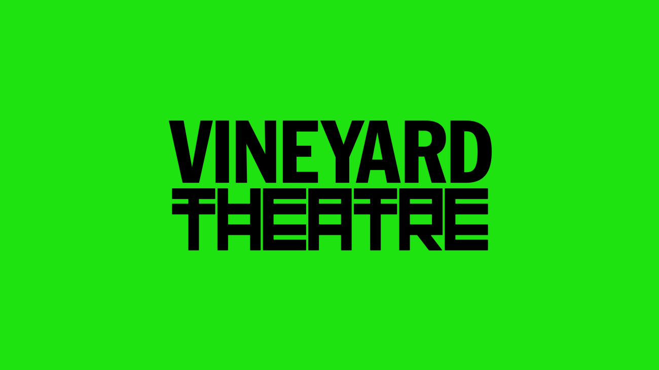
by Matt Willey
Matt’s logo, to me communicates the idea of the interference and infiltration of the trolls themselves to influence the 2016 election through the indistinguishable duplication of the word Theatre with its Russian inspired letterforms.

Pentagram write-ups
My takeaways from the New Yorkers that we’ve worked with thus far has shown the genuine love that us designers have for our profession. Everyone who volunteered their skills treated the project with the same level of detail, thought and passion as you’d expect from a paid job for one of their own clients – it showed me that sometimes simply doing something for the love of it is the most rewarding work we can do. I think the success of this collaborative approach is how contained our brief has been – we provide collaborators with a synopsis of the performance, a strict canvas size but that’s it – what goes on this canvas is completely left to the designer’s discretion, leaving them ultimate freedom to “just play”. I’ve loved keeping an eye on my inbox to see what comes in, each submission has surprised and delighted in equal measure. I can’t wait for the next season of key arts with the Vineyard and the next batch of collaborators we’ll be working with.
A huge thank you to:
Eddie Opara
Kate Melvin
Graham Taylor
Paul Owen
Matt Willey
If you’re a New York-based designer who’d like to put your typographic spin on a Vineyard logo, please get in touch at mail@nbstudio.co.uk
Share