The harder the brief the better
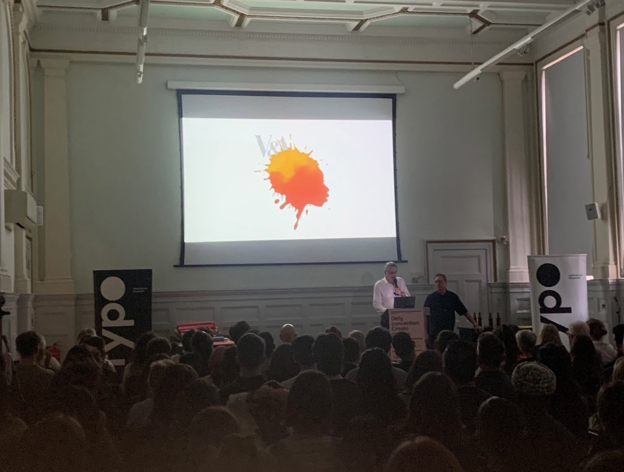
Last week Nick and I talked at the Typocircle about rules and how to bend, break and ignore them. It was also an excuse to share 27 years of our favourite work and the stories behind them. The next day I was sent this picture and it got me thinking…NB has always thrived creatively on tough briefs. The harder the brief the better.
Way back in 2007, NB was commissioned by Jane Scherbaum, Head of Marketing at the V&A.
Nick and I had previously worked with Jane (when she held the same job at Tate) on at least 10 major exhibitions, including the Warhol retrospective at Tate Modern.
The nuances of client-agency relationships from brief to concept are complex (I fear another post).
Jane and NB had already established an honest way of working – if she didn’t like something, she would tell you and often did. We always tried harder – if you got a nod from Jane when presenting, you knew you were on the right track.
A healthy collaboration of mutual trust is essential for any creative relationship – this always marks out NB’s best and most enduring work. This brief was no exception as it was high-profile, layered and more than just a campaign poster – it was a nationwide initiative to commemorate the abolition of slavery ‘Remembering Slavery’.

“Alan, just illustrate the bloody title”
I will never forget the design advice that my boss at Pentagram, John McConnell, once shared with me back in the last century. I was stuck while designing a book cover (I used to design over 300 book covers a year for Faber & Faber), and his words of wisdom were invaluable.
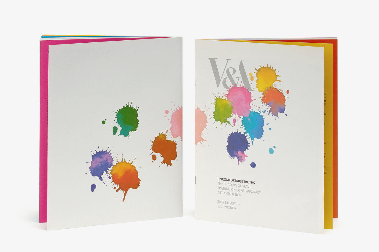
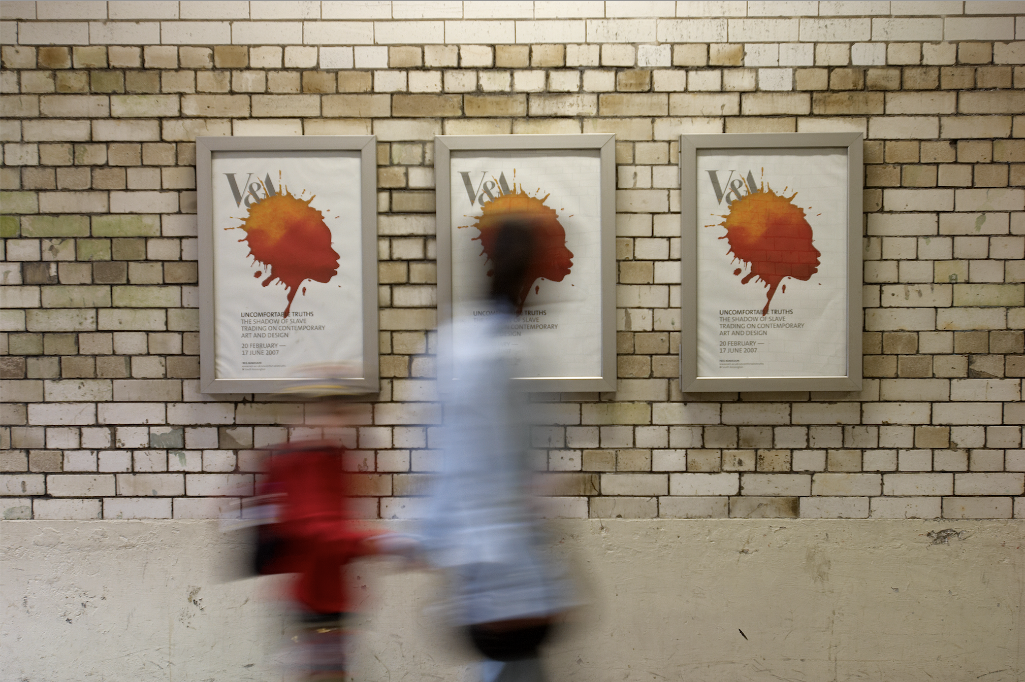
However, John’s words of wisdom didn’t help in this case. Illustrating the title was not an easy task, given the complex and highly charged subject matter. Not only was the V&A commissioning eleven contemporary artists from Europe, Africa, and America to mark the two-hundredth anniversary of the bill outlawing the British slave trade, but the title, Uncomfortable Truths – The Shadow of slave trading on Contemporary Art and Design exhibition marking the bicentenary of the outlawing of the British slave trade – part of a national initiative, ‘Remembering Slavery’ wasn’t giving me any clues.
It was just giving me a design headache.
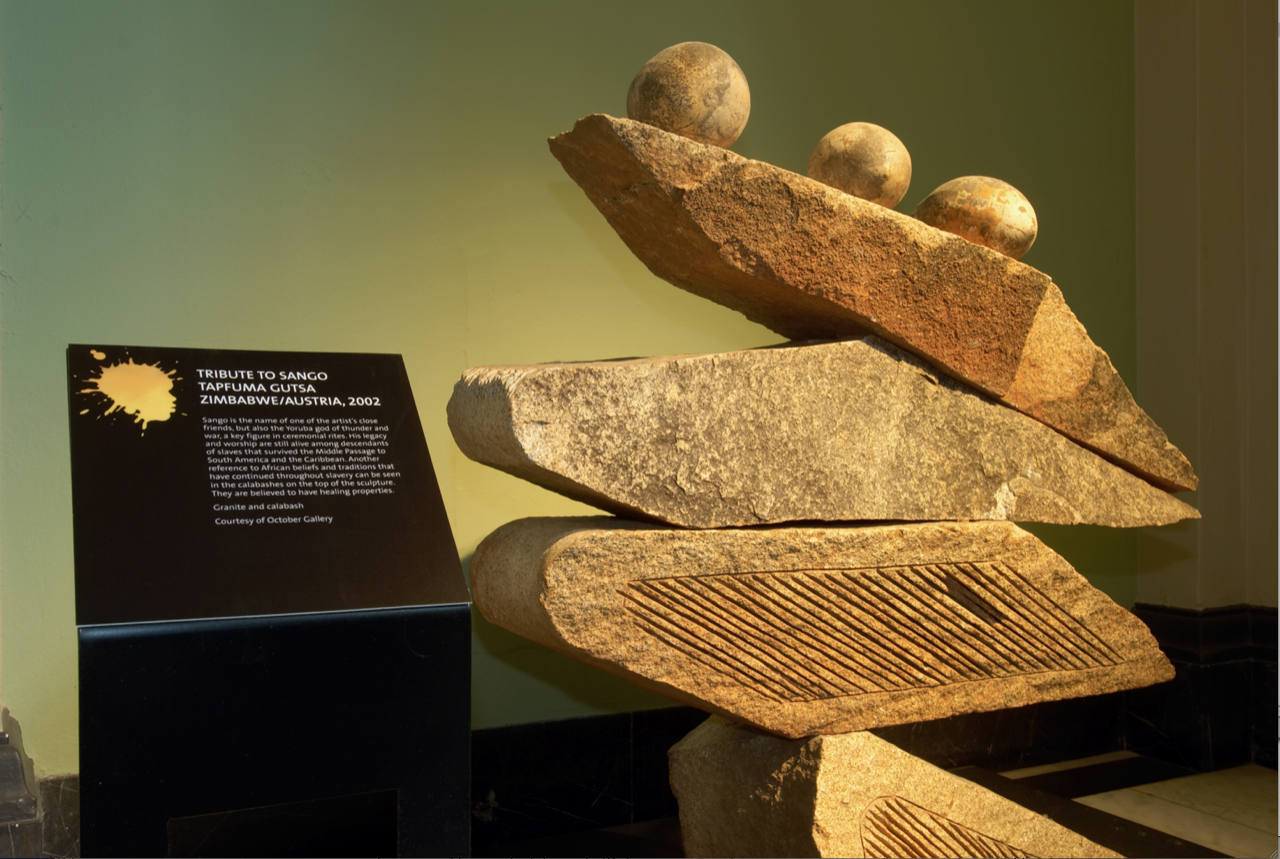
In addition to the project’s complexity, it was crucial to create a series of trails that would guide visitors to specific objects in the collections. These objects would highlight the theme, as the artist’s work was featured throughout the V&A, drawing attention to the hidden, overlooked, and painful stories connecting some of the historic objects to the slave trade of past centuries. Moreover, we were not permitted to use any of the artist’s work.
Ugh ….
We were stuck with the deadline looming and had a wall and floor covered in half-baked, incredibly boring ideas.
I gave Jane a call.
“How about we have a work-in-progress meeting?”
We didn’t receive any nods when we presented, not good. However, she left with some wise words.
“Don’t overthink it – go abstract”
I strongly believe that sometimes your subconscious mind needs time to catch up with your conscious mind. The coloured splashes we were experimenting with turned into 11 silhouettes, each representing an artist. These silhouettes worked beautifully as a signage system and posters. I love those moments when 1+1 equals 3.
We don’t often display this image nowadays. It’s 17 years old, but from time to time, when we clean off the dust from the 35mm slide, I still believe that the concept and its creation stand the test of time. I still feel proud of it today.
Finally my advice when you get stuck on a design project…go for a walk.
Share