Creative courage takes two
Audiences love to be astonished but it takes guts from both designer and client. Amazing things happen when informed passion meets visionary ambition.

The great Alan Fletcher famously said that if the client doesn’t wince when you tell them your fee you’re not charging enough – and they don’t appreciate that they are getting something special. And how much more special does it get than the work in Fletcher’s archive?
The same surely applies to design ideas. If they don’t challenge the client’s preconceptions then the designer isn’t doing their job. Chances are they are giving the client what they think they want – the safe option – or aping their competitors so as not to disturb the status quo. Yet invariably the people who set the brief aren’t the intended audience.
People are more likely to respond to something that stands out and defies convention in a way that is appropriate for them and for the brand. A fresh creative approach speaks volumes about a company or organisation, as long as it is an honest reflection of its values and culture.
Experience shows that great ideas work. They build loyalty, create leaders and can bring commercial success. But it’s not always easy to sell them in.

© Wolff Olins
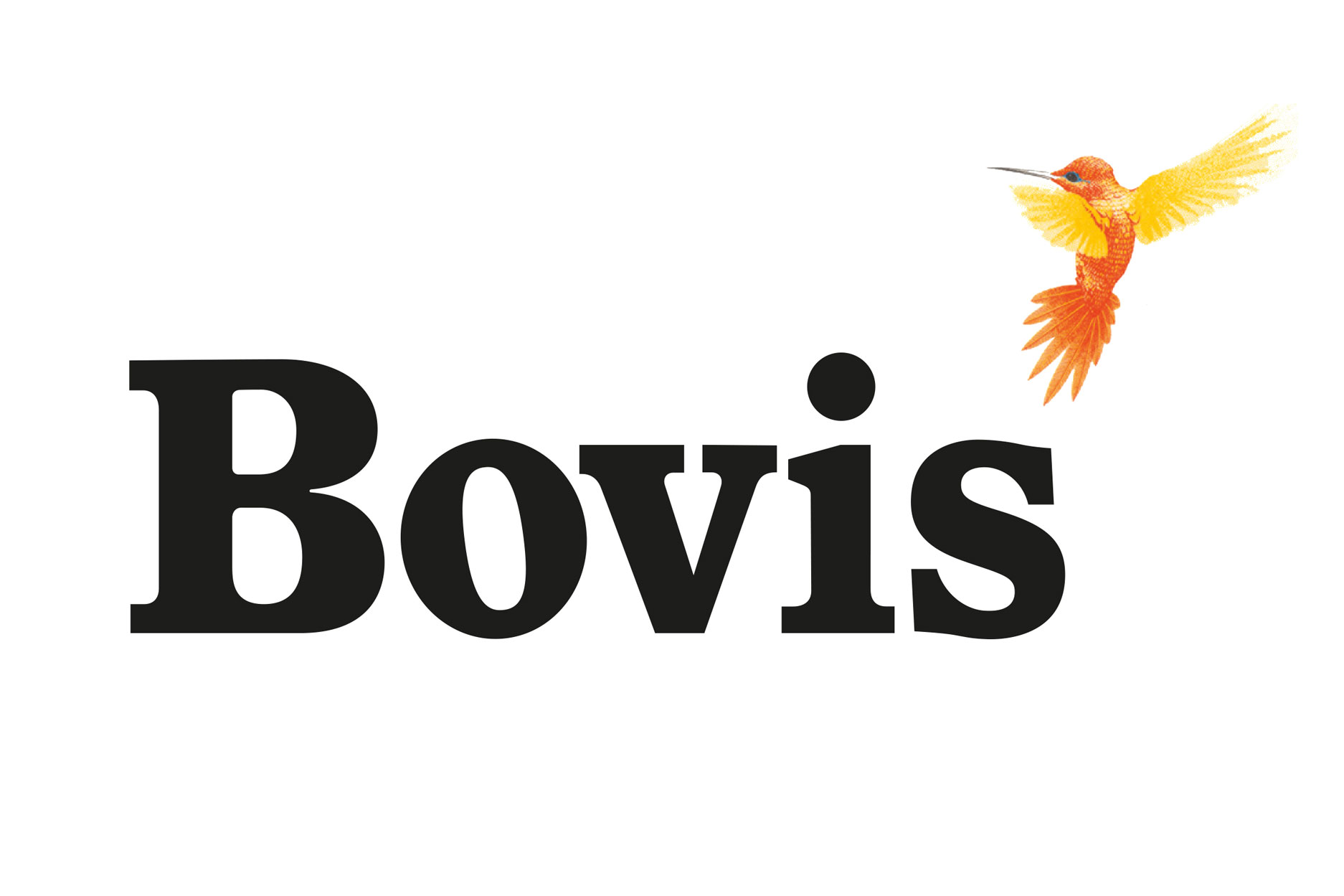
Did building contractor Bovis, for example, see itself as a hummingbird back in the 1970s when Wolff Olins set it apart from its more muscular rivals, creating a timeless design classic in the process? Probably not, but its bold acceptance of Wolff Olins’ vision won it worldwide acclaim and brightened the grimy world of construction.It took guts for Asda to let Lewis Moberly put art on its own-brand wines and spirits in the late 1980s. But the supermarket had a huge appetite for innovation – own-brand was just finding its feet as a cheaper but acceptable alternative to brands and asda was leading the charge. It also showed pride and trust in the power of design and Mary Lewis’s creative judgment in particular.
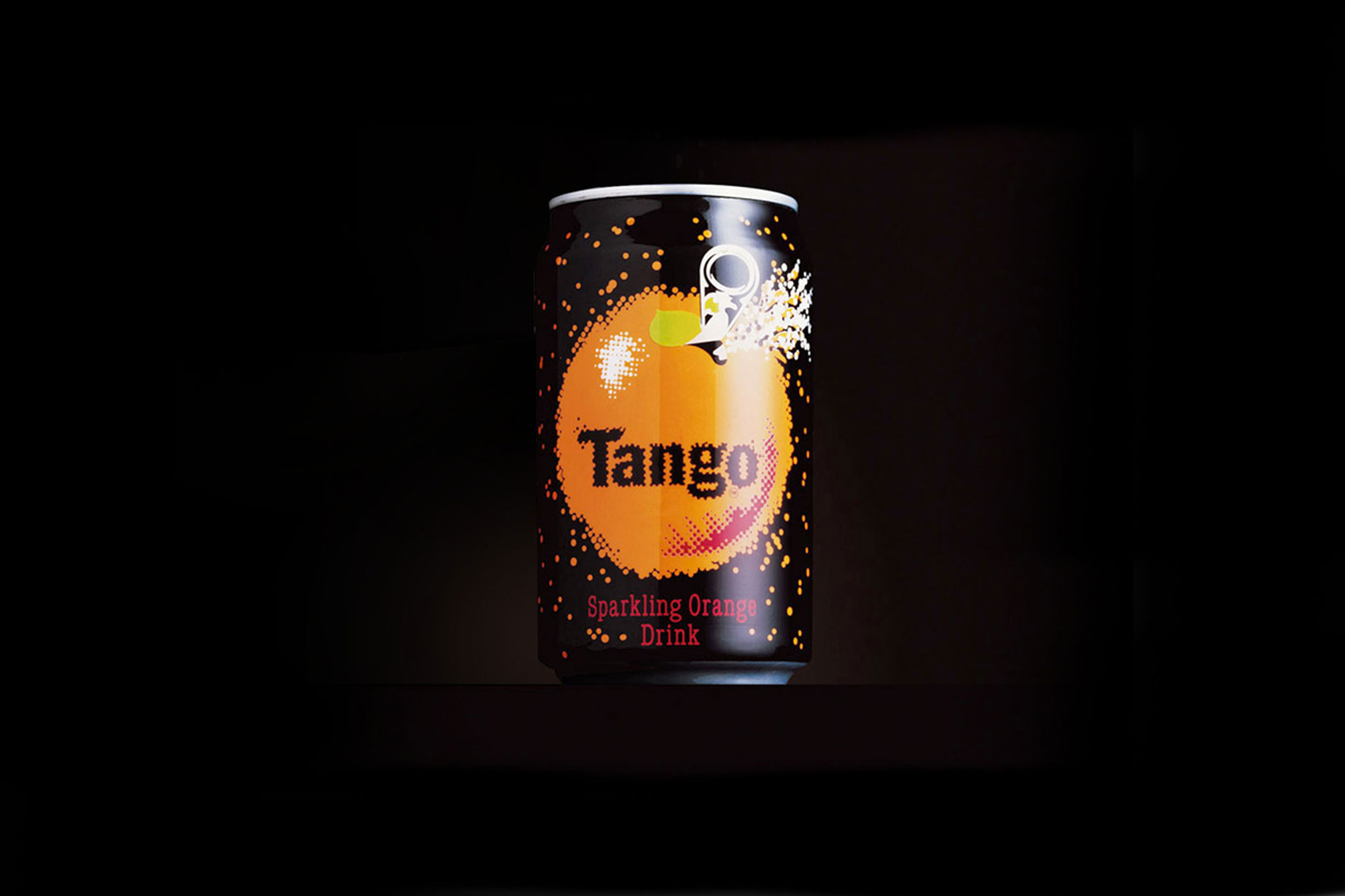

© Brandhouse's original Tango 1990s design, unknown photographer
Even the design community wasn’t ready for Britvic’s category breaking Tango drinks cans by Wickens Tutt Southgate when, in 1993, they controversially stormed the packaging awards. Pack designers had become accustomed to the elegant type and beautifully crafted illustrations that no longer stood out on the shelf and were shocked by Tango’s brash graphics and Gotan character. Not so the young people who were the target market.

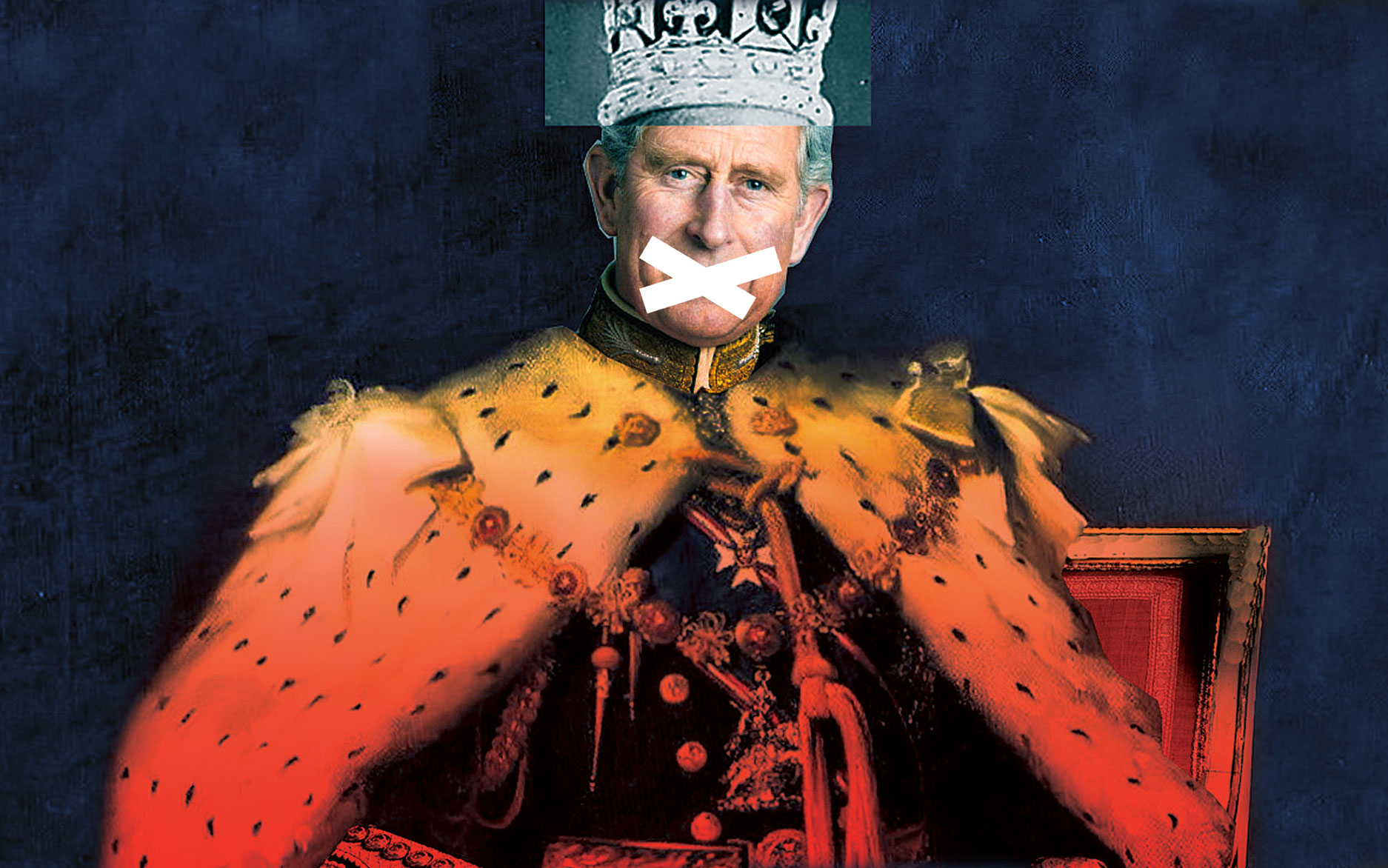
And though the savvy audience for North London’s slightly off-beat Almeida Theatre is primed to accept the avant garde, what does it make of NB’s hugely expressive posters? Imagery for plays like Mike Bartlett’s King Charles III and the Las Vegas-based interpretation of William Shakespeare’s Merchant of Venice, both directed by Rupert Goold, flouts convention, yet the plays have been sell outs.
Historic though most of these examples are, all involved memorable designs that shifted perceptions and boosted sales. People want to be delighted, informed and engaged and will respond in kind, especially at a time when, as now, we are deluged by so many messages coming in from all quarters.
It takes courage though, particularly on the part of a client. They, after all, are taking the commercial risk. Few design commissioners have the luxury of, say, Innocent drinks founder Dan Germain or Sir Jonathan Ive at Apple to put creativity first in all their business dealings. The likes of Germain and Ive can take a flyer on ideas because they know that a creative approach works for their brand and have the expertise to hone them appropriately.
But it also takes a courageous designer to generate and push great ideas forward. Too often the client is seen as scary, resistant to change and concerned only with an efficient job well executed for minimal cost. Yet amazing things can happen when informed passion on the part of the designer meets the ambition of a visionary client. Even the toughest boardroom can be breached to the benefit of all concerned and the delight often of the customer. Perceptions change for the better, sometimes for ever.
Can we have more of that please?
